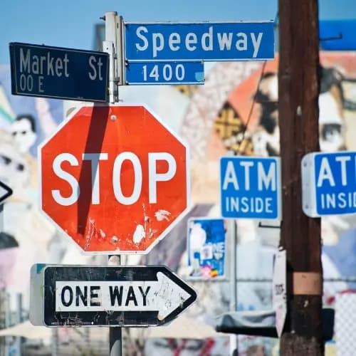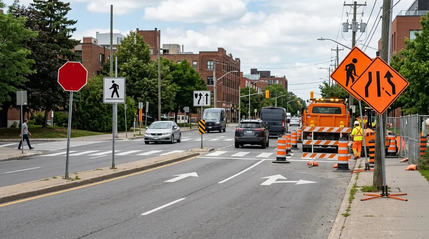



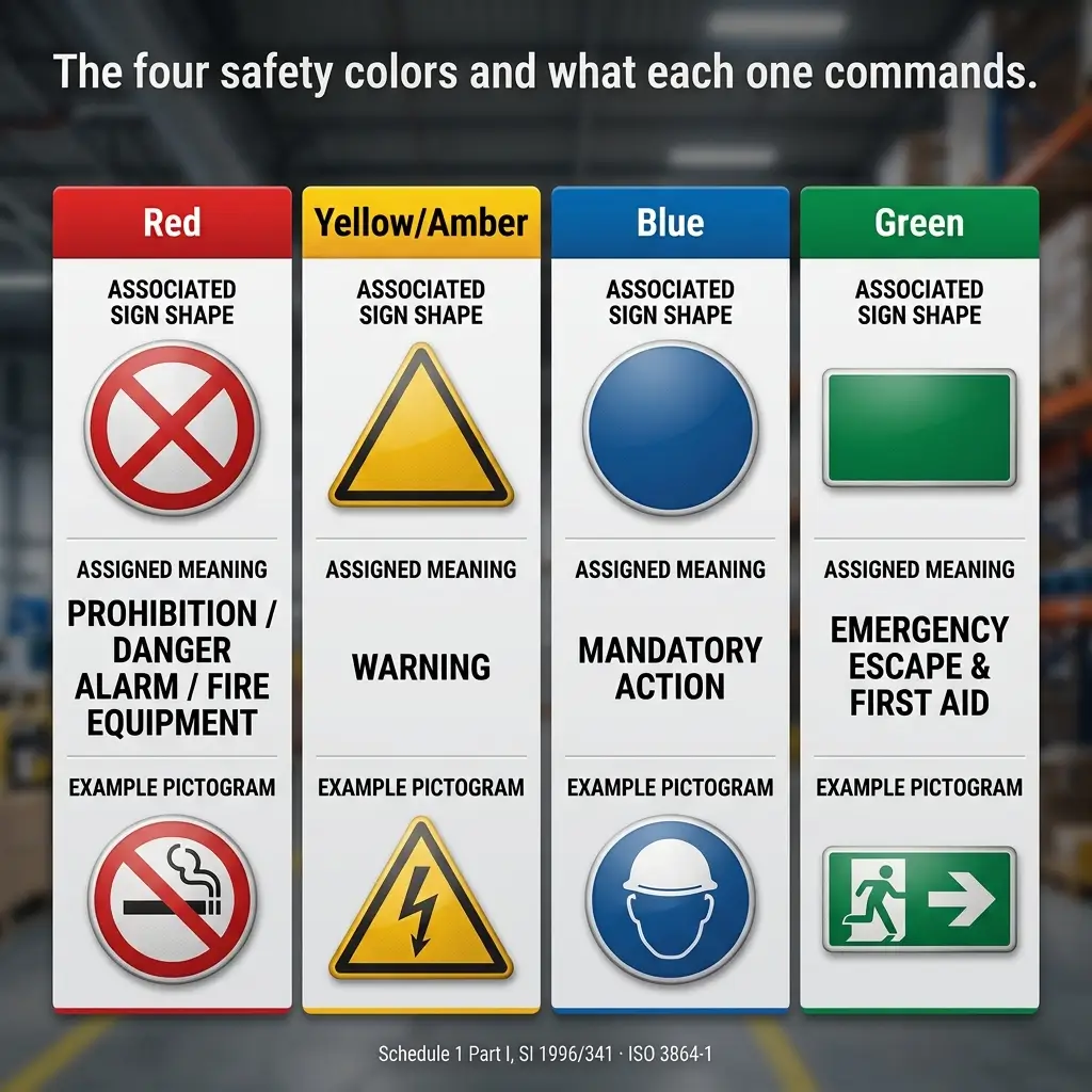
Four colors carry most of the meaning on a workplace sign: red for prohibition and danger, yellow for caution, blue for a mandatory action, green for safe condition and escape. That answer holds across the UK, the EU and the ISO system. It does not hold in the United States, where OSHA's safety color code at 29 CFR 1910.144 assigns a meaning to exactly two colors — red and yellow. Everything an American reader has been taught about orange, green and blue comes from consensus standards, not from the regulation.
Most of my work sits on multi-language sites: container terminals at Jebel Ali and Rotterdam, EPC interfaces at Ras Laffan, offshore maintenance campaigns on the UKCS. On those sites the color is doing work no toolbox talk can do, because it reaches people who will never read the English text underneath it. This article covers what each color means, where the three systems diverge, and how color coding fails in the field even when the signs themselves are perfectly correct.
Key takeaways
Six points carry the rest of this article:
- The UK and EU color scheme is set in law by Schedule 1 of the Health and Safety (Safety Signs and Signals) Regulations 1996: red for prohibition, danger alarm and fire-fighting equipment; yellow or amber for warning; blue for mandatory; green for emergency escape, first aid and "no danger".
- OSHA's color code names only red and yellow. The familiar orange–blue–green hierarchy comes from ANSI Z535.1, a voluntary consensus standard.
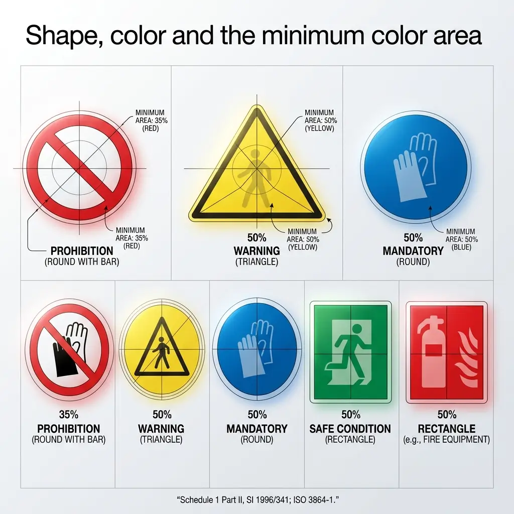
- Color is only half the signal. Schedule 1 of the 1996 Regulations and ISO 3864-1 also fix the shape and the proportion of the sign the color must occupy — at least 50% for warning, mandatory, escape and fire signs, and at least 35% for the red band and bar on a prohibition sign.
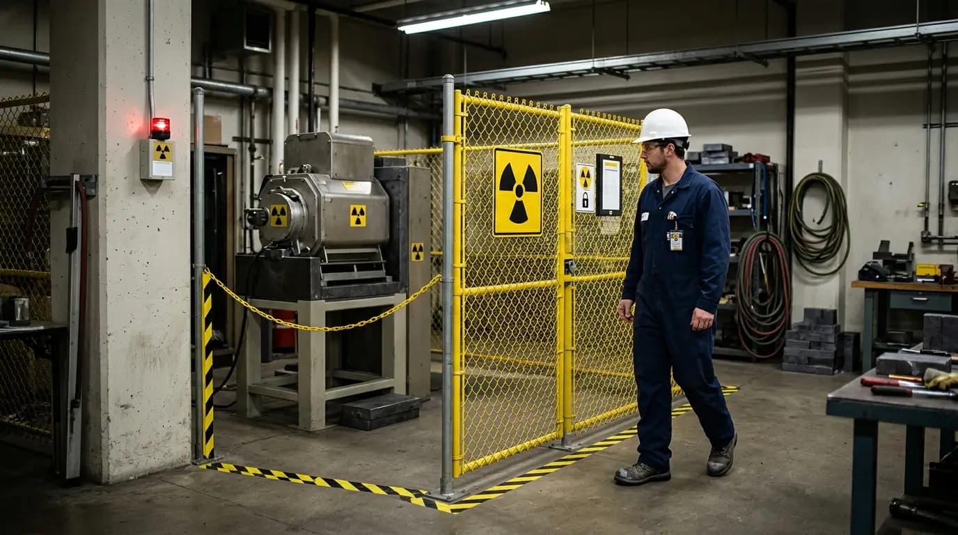
- "Purple means radiation" is a US-specific rule about a symbol, not a general sign color: 29 CFR 1910.1096(e) requires the three-bladed trefoil in magenta or purple on a yellow background.
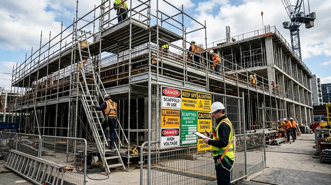
- Both the UK regulations and OSHA's construction standard require signs to come down when the hazard goes. A sign that outlives its hazard trains people to ignore the next one.
- Signage is a residual control. UK regulation 4(1) only requires signs where the risk assessment shows the risk cannot be avoided or adequately reduced by collective protection first.
What each safety sign color means
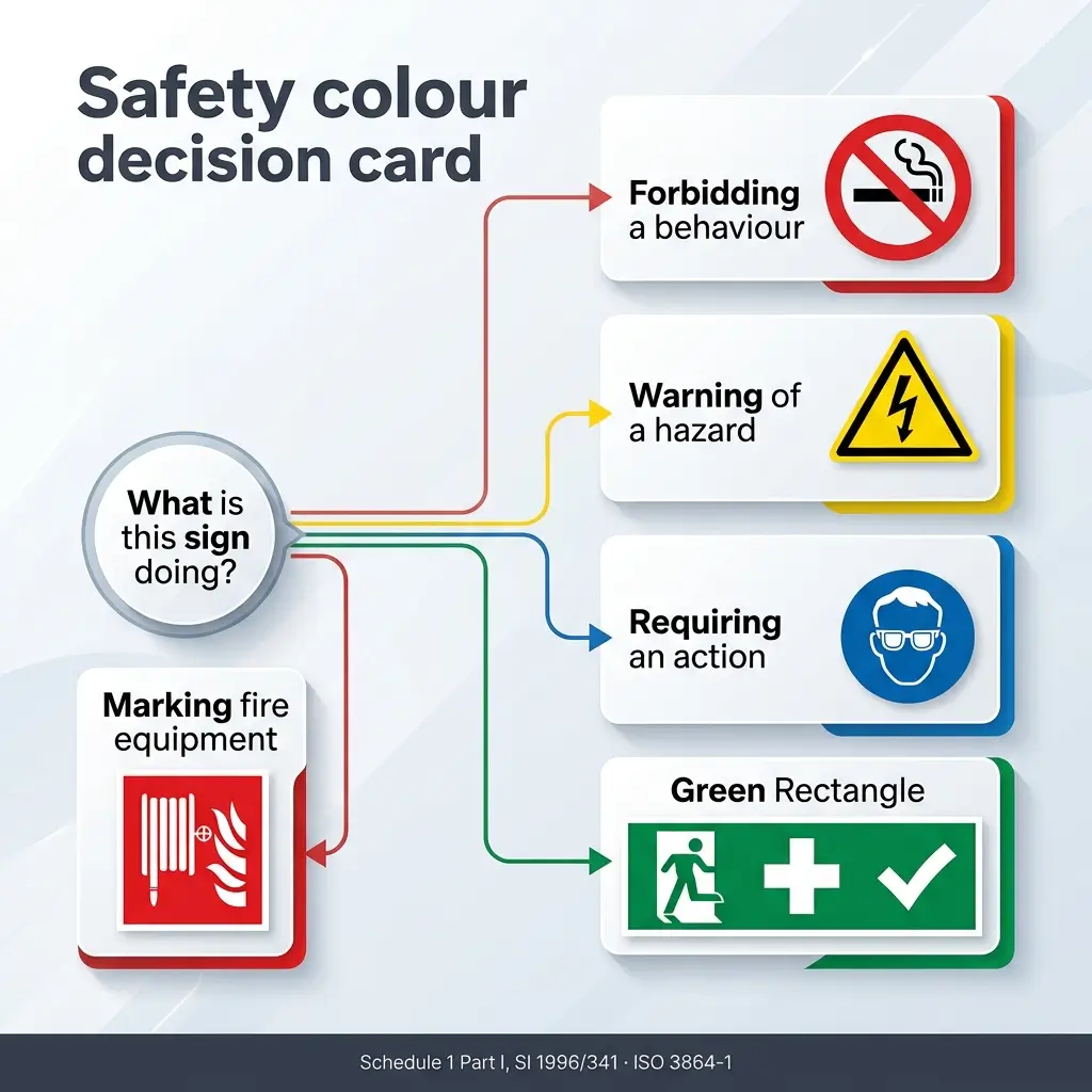
A safety color, in the words of the UK regulations, is simply "a colour to which a meaning is assigned." The assignment is arbitrary in the way that all language is arbitrary — and, like language, it only works if everyone on site has been taught the same vocabulary. The four-color scheme below is the international baseline. Learn this one and you can read a sign in a Norwegian machine hall, a Qatari construction camp or a Portuguese furniture factory without reading a word of text.
| Color | Meaning | Typical use | Shape it appears on |
|---|---|---|---|
| Red | Prohibition; danger alarm; fire-fighting equipment | No smoking, no entry, emergency stop, extinguisher location | Round with diagonal bar (prohibition); square or rectangle (fire) |
| Yellow or amber | Warning | Corrosive material, overhead load, drop, forklift traffic | Triangle |
| Blue | Mandatory action | Eye protection must be worn, pedestrians must use this route | Round |
| Green | Emergency escape, first aid, safe condition | Fire exit, first-aid post, safety shower, eyewash | Square or rectangle |
Source: Schedule 1, Part I, Health and Safety (Safety Signs and Signals) Regulations 1996; ISO 3864-1.
Red — prohibition, danger and fire equipment
Red does three jobs, and confusing them is the most common design error I see on new sites. A round red-bordered circle with a diagonal bar prohibits a behaviour. A solid red square or rectangle with a white pictogram identifies fire-fighting equipment. And red as a plain surface colour marks the equipment itself — under Part IV of the UK regulations, fire-fighting equipment is identified by red paint over an area large enough to find the equipment from a distance.
In the US, red carries a narrower statutory job. Under 1910.144(a)(1), red is the basic color for fire protection equipment, for danger signs, for safety cans holding flammable liquids with a flash point at or below 80 °F, for red lights at barricades and temporary obstructions, and for emergency stop bars and stop buttons.
Yellow and amber — caution and physical hazards
Yellow is the one color where the US and international systems genuinely agree. OSHA's 1910.144(a)(3) makes yellow the basic color for designating caution and for marking physical hazards, and names the hazards it has in mind: striking against, stumbling, falling, tripping, and caught-in-between. The UK regulations use yellow or amber for the warning triangle.
Yellow also does floor and structure work that has nothing to do with signboards. Under Part V of the UK regulations, places where there is a risk of collision, falling, or falling objects should be marked with alternating yellow and black — or red and white — stripes at roughly 45°, in bands of more or less equal size. Vehicle traffic routes are marked with continuous stripes in a clearly visible color, preferably white or yellow, chosen against the color of the floor.
That last clause matters more than it reads. On a terminal apron that has been resurfaced, yellow lines on fresh grey concrete and yellow lines on sun-bleached asphalt are not the same control.
Blue — mandatory action
Blue is the instruction color: a round sign, white pictogram, blue background, telling you what you must do before proceeding. Hard hat, eye protection, safety harness, respiratory protection, "pedestrians must use this route."
Blue is also the clearest example of the transatlantic gap. It appears nowhere in 1910.144. In the ANSI Z535 system, blue is the background for the NOTICE signal word, used for messages about property damage, security, sanitation and housekeeping — a materially different meaning from "you must wear this." A worker who learned blue in Rotterdam and then reads a blue sign in Texas is reading two different languages that look identical.
Green — safe condition, escape and first aid
Green marks the way out and the help: emergency exits and escape routes, first-aid posts, stretchers, safety showers, eyewash stations, emergency telephones. It also carries the meaning "no danger — return to normal," which is why green is used for all-clear conditions rather than for a hazard.
US construction and general industry both use green, but for a slightly different category. Safety instruction signs under 1910.145(d)(6) have a white background with a green panel and white letters — general safety instructions rather than an escape route.
The colors people add
Orange, magenta and purple show up constantly in articles about sign colors, usually presented as if they sat alongside the four above. They do not, and it is worth being precise about where each one actually comes from.
The additional colors, and the instrument that genuinely governs each, are:
- Orange — the background for the WARNING signal word panel in ANSI Z535.2, and OSHA's recommended (not mandated) tag color for a hazard level between Caution and Danger. Not a UK or ISO sign color.
- Magenta or purple — the color of the ionising radiation trefoil under 1910.1096(e)(1), always on a yellow background. Yellow is doing the "caution" work; magenta identifies which caution.
- Fluorescent orange or orange-red — OSHA's recommended color for biological hazard tags, per Appendix A to 1910.145(f).
- Black and white stripes, or red and white stripes — obstruction and drop marking, not a signboard color at all.
Why the same color means different things in the US, UK and ISO systems
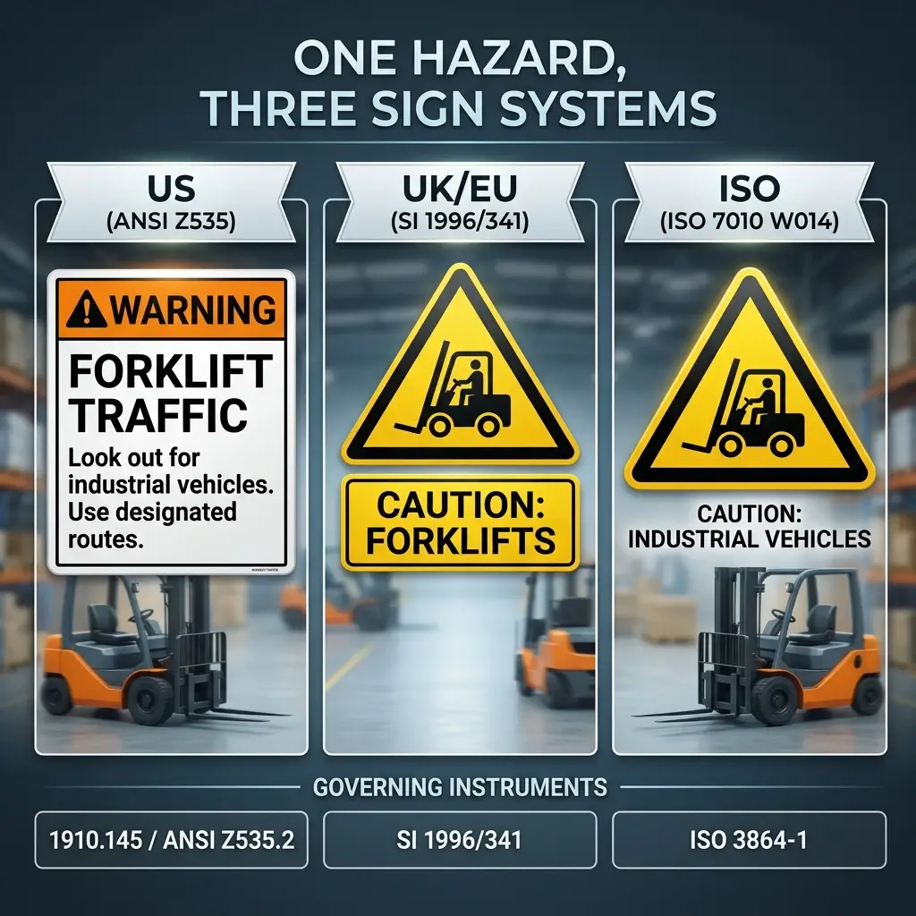
There is no single global safety color code, and pretending otherwise is how multinational sites end up with three sign systems on one fence line. The US built its scheme from ANSI's signal-word tradition, which grades hazards by severity. Europe built its scheme from a directive that grades signs by function — is this forbidding, warning, instructing, or directing? Those are different logics, and they produce different signs from the same hazard.
The table below sets out where a specifier actually looks in each system.
| United States | United Kingdom / EU | International (ISO) | |
|---|---|---|---|
| Governing instrument | 29 CFR 1910.144, 1910.145; 1926.200 (construction) | SI 1996/341, implementing Directive 92/58/EEC | ISO 3864-1 (design), ISO 7010 (registered signs) |
| Legal status | Mandatory regulation | Mandatory regulation | Voluntary unless adopted (BS EN ISO 7010 in the UK) |
| Colors given legal meaning | Red and yellow only | Red, yellow/amber, blue, green | Red, yellow, blue, green |
| Organising logic | Severity — Danger, Caution, Safety Instruction | Function — prohibit, warn, mandate, direct | Function, harmonised with severity via signal words |
| Consensus layer | ANSI Z535.1–.6 | BS EN ISO 7010 | ISO 3864-3, ISO 3864-4 |
United States — two regulated colors and a consensus layer on top
OSHA's sign rules split by industry. General industry sits under 1910.145, which recognises three sign classes: Danger signs in red, black and white; Caution signs with a yellow background and a black panel with yellow letters; and Safety instruction signs, white background with a green panel and white letters. Note what is missing: there is no Warning sign class in 1910.145. Warning exists only for tags, at 1910.145(f)(7), as an optional intermediate level between Caution and Danger.
Construction sits separately under 1926.200, with its own specifications — danger signs with red as the predominating color on the upper panel, a black border outline and a white lower panel for wording; exit signs lettered in red at least 6 inches (152 mm) high on a white field, with a principal stroke at least three-quarters of an inch (19 mm) wide.
ANSI Z535 sits on top of both. It is a voluntary consensus standard, and OSHA incorporates specific ANSI editions by reference for color specification. Where a facility follows Z535.2 by choice, the color set expands to the familiar four-signal-word ladder, which is where orange and NOTICE blue enter US practice.
United Kingdom and EU — function, and a proportion requirement
The UK scheme is prescriptive in a way the US scheme is not. Schedule 1 Part II fixes shape, pictogram colour and the area the safety colour must occupy for each of five signboard types. It also fixes the conditions of use: signs go at the access point for a general hazard or in the immediate vicinity of a specific one, at a height suited to the line of sight, in a well-lit and visible location — and where natural light is poor, phosphorescent colours, reflective materials or artificial lighting should be used.
Two clauses in that Schedule get ignored more than any others. Paragraph 2.2 of Part I requires the signboard to be removed when the situation it refers to ceases to exist. Paragraph 5.1.1 warns against placing too many signs too close together. Both address the same failure: a fence covered in signs communicates nothing.
International — ISO 3864-1 and ISO 7010
ISO 3864-1 sets the design grammar — the five permitted combinations of safety colour, contrast colour and geometric shape — and ISO 7010 is the registry of individual signs built to that grammar, each with a reference number such as P002 for "no smoking" or E001 for an emergency exit. The current edition is ISO 7010:2019 (with a corrected version issued in June 2020). ISO moved it to "to be revised" status in March 2025, a draft international standard is in progress, and amendments are still being published against the 2019 text — Amendment 11 was published in March 2026. If you are specifying signs for a long-life asset, check the current amendment list rather than the edition year.
For a multinational operator, ISO 7010 is usually the right base system precisely because it is the least language-dependent. In the US it satisfies no regulation on its own, so American sites running ISO 7010 signage still need to demonstrate compliance with 1910.145 or 1926.200 separately.
Three divergences catch out multinational specifiers most often:
- Blue — mandatory action under ISO and UK law; the NOTICE background under ANSI Z535
- Orange — a full signal-word level in ANSI practice; absent from the UK and ISO sign colour set
- Warning — an ANSI sign class and an OSHA tag class, but not an OSHA sign class under 1910.145
Shape and color area: the specification most people skip
Color tells a worker what category of message this is. Shape tells them the same thing a second time, which is what makes the system survive dim light, distance, dirt and colour-blindness. Around one in twelve men has some form of red–green colour vision deficiency, so a system that relies on colour alone excludes a meaningful share of any workforce. Shape is the redundancy that fixes it.
The UK regulations and ISO 3864-1 both go further and specify how much of the sign the colour must occupy. This is the detail I check first when a supplier sends a proof, because a sign that is technically the right colour but mostly white text panel does not read as a warning at twenty metres.
The intrinsic features fixed for each signboard type in Schedule 1, Part II of SI 1996/341, and mirrored in ISO 3864-1, are:
- Prohibitory — round; black pictogram on white; red edging and diagonal line; the red part at least 35% of the sign area [SI 1996/341, Sch. 1 Pt II, para 3.1]
- Warning — triangular; black pictogram on yellow with black edging; the yellow part at least 50% [para 3.2]
- Mandatory — round; white pictogram on blue; the blue part at least 50% [para 3.3]
- Emergency escape or first aid — rectangular or square; white pictogram on green; the green part at least 50% [para 3.4]
- Fire-fighting — rectangular or square; white pictogram on red; the red part at least 50% [para 3.5]
Source: Health and Safety (Safety Signs and Signals) Regulations 1996, Schedule 1, Part II.
Sign size is a separate calculation driven by viewing distance rather than by hazard severity, and ISO 3864-1 provides the method. Specify a sign because of how far away it must be read, not because the hazard feels serious.
Signal words: where the color and the word must agree
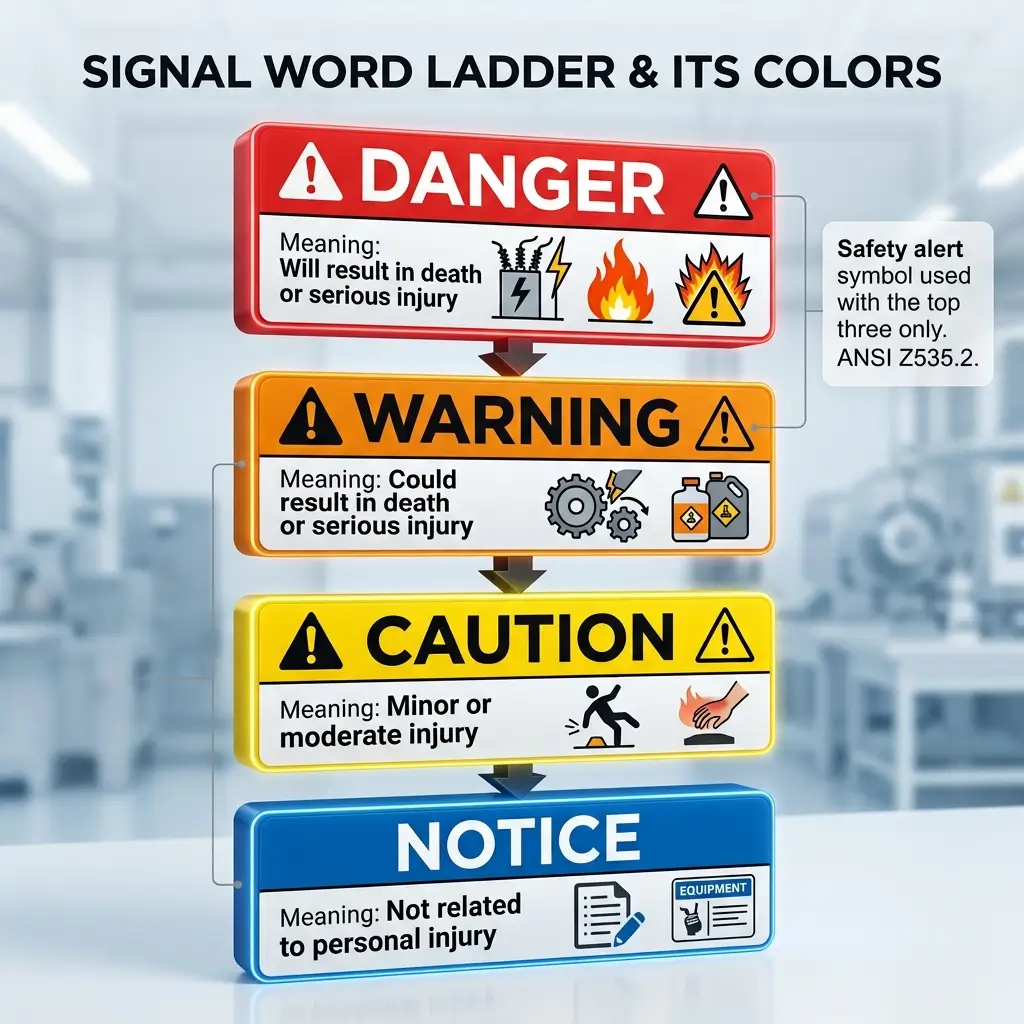
In the US system a sign carries a signal word as well as a colour, and the pairing is fixed. Getting it wrong is not a cosmetic problem — signal words are graded by consequence, and using the wrong one either understates a lethal hazard or devalues the word that should have stopped someone.
Three things practitioners routinely get wrong here are worth stating plainly.
"DANGER and WARNING are interchangeable." They are not. Under ANSI Z535.2, DANGER indicates a hazardous situation that will result in death or serious injury if not avoided, and is limited to the most extreme situations. WARNING indicates a situation that could result in death or serious injury. CAUTION covers minor or moderate injury. The difference between "will" and "could" is the whole grading.
"OSHA requires a WARNING sign." It does not. 1910.145 recognises Danger, Caution and Safety instruction signs. WARNING appears in the tag provisions at 1910.145(f)(7) as a permitted intermediate level, and in the ANSI system a facility may adopt voluntarily. If your general industry site runs orange WARNING signs, you are following ANSI Z535, which is a good decision — just know which document you are complying with.
"NOTICE means the same as CAUTION." NOTICE addresses practices not related to personal injury: property damage, security, housekeeping. It is blue in the ANSI scheme, and the safety alert symbol — the exclamation mark in a triangle — is not used with it. That symbol belongs to personal-injury hazards only.
Where color coding fails on live sites
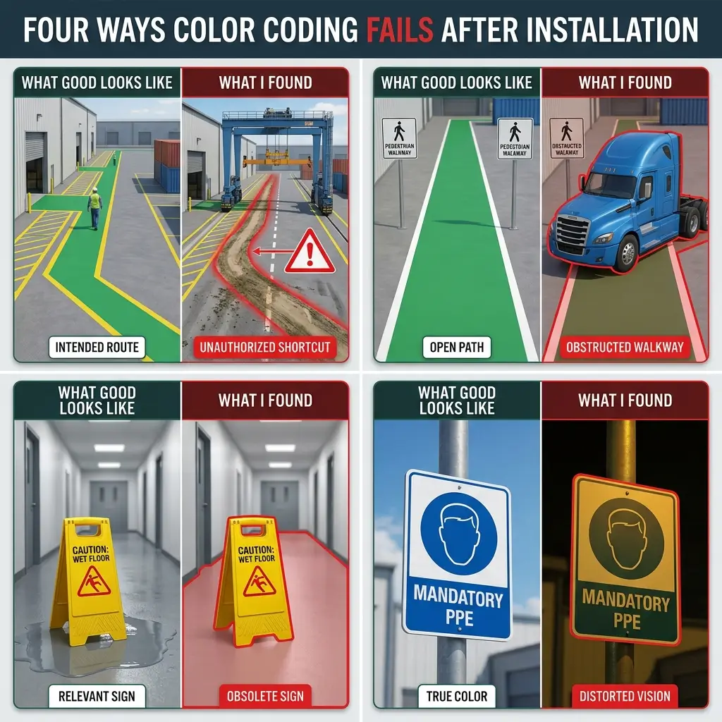
Everything above describes signs that are correctly designed and correctly installed. In 180-plus workplace inspections I have almost never written a finding about a sign being the wrong colour. The findings are always about something else: the sign was right and the system around it had quietly stopped working.
The marking that was never there
Walking the yard at Jebel Ali at 02:10 during a night container operation, I found a worn dirt shortcut cutting straight across an active rubber-tyred gantry lane. No barrier, no marking, no sign. The lane itself was correctly marked. The route people were actually using was not, because nobody had designed it — it had been worn into the ground by night shift crews taking the shorter walk to the amenities block.
I closed the shortcut, had the lit walkway reinstated, and briefed shift control before the next vessel peak. Night pedestrian deviations on that sector dropped in follow-up observations.
The transferable point is about where you audit, not what you audit. A desire path is a piece of information: it tells you that the marked route is longer, darker or less convenient than the unmarked one. Walk your site at the hour the work actually happens, and mark the route people use — or make the marked route the shorter one.
The marking that convenience beat
During a vessel discharge at Rotterdam, I found a terminal tractor parked nose-in across a painted pedestrian walkway. The paint was fresh. The walkway was correctly specified, correctly coloured, and completely blocked.
I moved the vehicle and asked the control room to message every driver on that shift. Walkway encroachment observations fell that week after the radio reinforcement — and that timing is the lesson. It fell because a leader defended the line out loud during production, not because the line existed.
Painted segregation is a control that decays under pressure unless someone actively maintains it. If your walkway markings have never generated an intervention, that is not evidence they are working.
The sign that outlived its hazard
Both systems address this and almost nobody enforces it. UK Schedule 1 requires the signboard to be removed when the situation it refers to ceases to exist. OSHA's construction standard at 1926.200(a) requires signs to be removed or covered promptly when the hazards no longer exist.
Turnaround and shutdown sites are where this breaks. Temporary signs go up in week one and stay up through week nine, by which point half of them describe hazards that were removed a month ago. Workers learn — correctly, from the evidence in front of them — that site signage is unreliable. The next genuine sign then has to compete with that learned scepticism.
Color that does not survive the conditions it lives in
A colour specification assumes a viewing condition. Three things break it in the field, and all three are cheap to check: high-pressure sodium lighting on an older yard flattens red and yellow toward the same muddy tone; chemical dust and salt spray shift a printed sign's colour within a season; and a sign specified for daylight and installed in an unlit corridor never meets the contrast it was designed for. The UK regulations anticipate this and call for phosphorescent colours, reflective materials or artificial lighting where natural light is poor.
Check the sign under the light it will live under, at the distance it will be read from, at the time of day the work happens. A daytime signage audit on a 24-hour site is a partial audit.
The four failure modes above share a pattern worth naming:
- The hazard moved and the marking did not — desire paths, relocated storage, new laydown areas
- The marking is correct and unenforced — segregation that no leader has ever defended out loud
- The sign outlived its hazard — temporary signage left up past the job, contrary to 1926.200(a)
- The viewing condition changed — lighting, weathering or distance that the specification never assumed
What I check on a signage walkaround
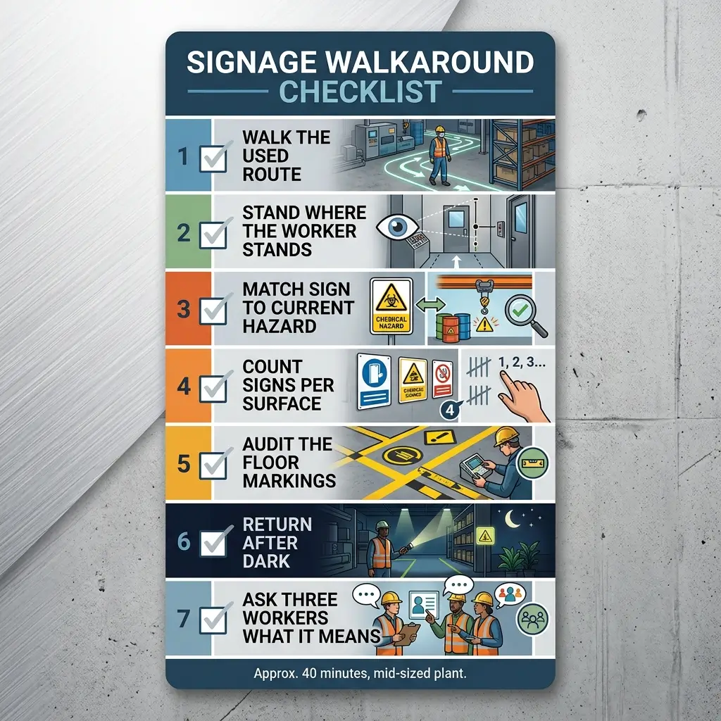
A signage audit that only compares signs to a catalogue will pass a site that is quietly unsafe. What follows is the sequence I actually use, and it takes about forty minutes on a mid-sized plant.
Work through these checks in order:
- Walk the route people use, not the route on the drawing. Look for desire paths, propped doors, and gaps worn in fencing.
- Stand where the worker stands. Read each sign from the approach direction and the working distance, not from arm's length.
- Check the sign against the hazard it names. A "corrosive material" triangle on a door to a room that now stores packaging is a live finding.
- Count the signs on one surface. More than about four on a single gate or door and none of them is being read.
- Look at the floor as carefully as the walls. Traffic route lines, hazard striping and pedestrian crossings are safety colour under the regulations and degrade faster than signboards.
- Return after dark, or at shift change. Lighting, fatigue and shift handover change what a sign can do.
- Ask three workers what a specific sign means. Not whether they have seen it — what it requires them to do. This is the only check that tests the control rather than the artefact.
Color coding only works if people have been taught it
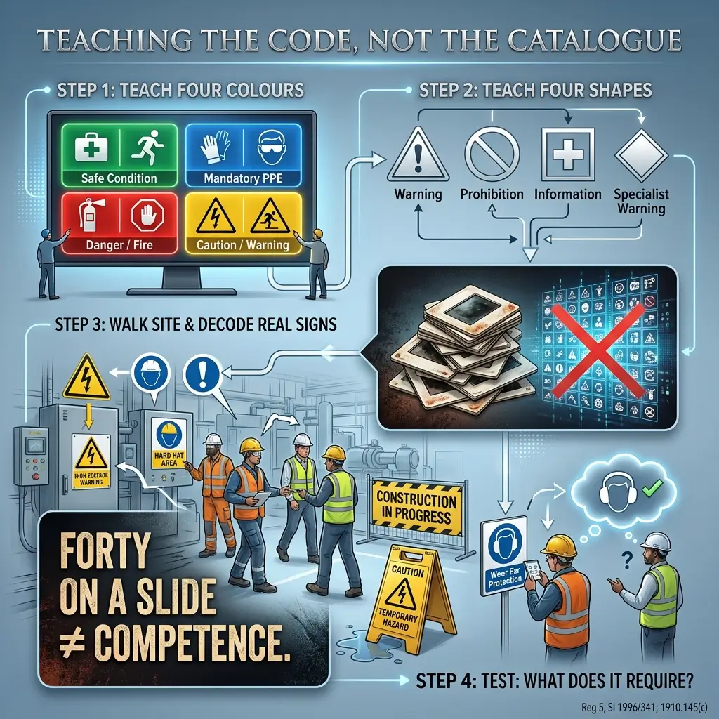
This is the part of the subject I spend most of my time on, and it is the part most signage articles leave out entirely. A safety colour is a code. A code that has not been taught is decoration.
Both jurisdictions treat this as a duty rather than good practice. UK regulation 5 requires employers to provide comprehensible and relevant information on the measures to be taken in connection with safety signs, and to ensure each employee receives suitable and sufficient instruction and training in the meaning of safety signs. OSHA is equally direct: 1910.145(c)(1)(ii) requires all employees to be instructed that danger signs mean immediate danger and that special precautions are necessary; 1910.145(c)(2)(ii) does the same for caution signs; and 1910.145(f)(4)(v) requires all employees to be informed of the meaning of the various tags used throughout the workplace.
Having trained something over 6,500 people across seventeen countries, the induction failure I see most often is teaching the catalogue instead of the code. A slide showing forty pictograms teaches nothing that survives a week. Teaching four colours and four shapes, and then walking the actual site pointing at real signs, produces people who can decode a sign they have never seen before — which is the whole point of a standardised system.
Three things are worth building into an induction on any multi-language site:
- Teach shape and colour as a pair, so the message survives poor light and colour vision deficiency
- Walk the real signs, including at least one temporary sign, so people learn that temporary signs are live information
- Name the system in use, especially on sites running both ANSI and ISO signage, so a blue sign does not mean two things on one site
Frequently asked questions
What are the four main safety sign colors?
Red, yellow or amber, blue, and green. Red prohibits or marks fire equipment, yellow warns, blue mandates an action, and green indicates escape routes, first aid and safe conditions. This scheme is set in law in the UK and EU and mirrored internationally by ISO 3864-1 and ISO 7010.
What does a yellow safety sign mean?
Yellow means caution — a hazard exists that you need to be aware of and take precautions against. Under OSHA 1910.144(a)(3), yellow marks physical hazards including striking against, stumbling, falling, tripping and caught-in-between. Internationally, yellow is the background of the triangular warning sign.
What color is a mandatory safety sign?
Blue. A mandatory sign is a round sign with a white pictogram on a blue background, and the blue must cover at least 50% of the sign area [source: SI 1996/341, Sch. 1 Pt II, para 3.3]. Common examples are eye protection, hard hats, hearing protection and safety harnesses. In the US ANSI system, blue instead denotes NOTICE.
Does OSHA require ISO 7010 signs?
No. OSHA requires compliance with 1910.145 for general industry or 1926.200 for construction, neither of which adopts ISO 7010. Many multinational employers use ISO 7010 signage voluntarily for language-independent communication, but a US site doing so must still meet the applicable OSHA specification.
What do purple safety signs mean?
Purple is not a general safety sign color. In the US, 1910.1096(e)(1) requires the three-bladed radiation trefoil to be magenta or purple on a yellow background. The yellow carries the caution meaning; the magenta identifies it as ionising radiation.
What is the difference between DANGER, WARNING and CAUTION?
Severity. Under ANSI Z535.2, DANGER means a hazardous situation that will result in death or serious injury and is reserved for the most extreme cases. WARNING means it could result in death or serious injury. CAUTION means minor or moderate injury. Their colors are red, orange and yellow respectively.
Do safety signs have to be removed when the hazard is gone?
Yes. Schedule 1 of SI 1996/341 requires a signboard to be removed when the situation it refers to ceases to exist, and OSHA 1926.200(a) requires construction signs to be removed or covered promptly when the hazards no longer exist. Leaving stale signs up erodes the credibility of every other sign on site.
Key points
Safety colours are a language with three dialects. The four-colour functional scheme — red, yellow, blue, green — is the international baseline and the one worth teaching first, because it transfers. The US system is narrower in law and broader in practice: two regulated colours, plus a well-established consensus layer that adds orange and a fourth signal word.
The technical specification is worth knowing precisely, because suppliers get it wrong and a proof is easy to check: shape and colour must agree, and the colour must occupy at least 50% of the sign — 35% for the red on a prohibition sign [source: SI 1996/341, Sch. 1 Pt II].
None of that is where sites actually fail. They fail because a marked route was longer than an unmarked one, because a painted line lost to a parked vehicle, because a temporary sign never came down, or because nobody ever taught the code. Signage is a residual control that sits below elimination, substitution and engineering in the hierarchy, and the UK regulations say so explicitly at regulation 4(1) — signs are required only where the risk assessment shows the risk cannot be adequately reduced by collective protection first.
If you take one action from this article, walk your site at the hour the work actually happens and ask three people what a specific sign requires them to do. Their answer tells you whether you have a control or a decoration.
The four things worth carrying away are:
- Learn the functional four — red prohibits, yellow warns, blue mandates, green means escape and safe condition
- Know which system your site runs, because blue means "you must" under ISO and "notice" under ANSI
- Check the proportion, not just the colour, when a supplier sends a sign proof
- Audit the route people use, at the hour they use it, not the route on the drawing
About the author — Chloe Anderson
Chloe Anderson is a British Occupational Health, Safety and Environment (OHSE) Technical Educator and Site Assurance Consultant with 16 years of continuous field experience across 17 countries. Her work on safety communication and competence spans multi-language, multi-contractor sites — container terminals for DP World and Maersk, EPC contractor interfaces for Fluor at Ras Laffan and Jamnagar, and offshore maintenance campaigns for Equinor — where signage and colour coding carry instructions that no written procedure reaches. She has trained over 6,500 professionals and inspected more than 180 workplaces. She currently leads Anderson OHSE Assurance & Education, based in Edinburgh, after senior roles with IKEA Industry, DP World, Novo Nordisk, Equinor, Dow, Fluor and Anglo American. Credentials: CMIOSH · NEBOSH National Diploma in Occupational Health and Safety · NEBOSH Certificate in Environmental Management · ISO 45001 Lead Auditor · ISO 14001 Internal Auditor · IOSH Managing Safely · CITB SMSTS · OPITO BOSIET with CA-EBS · IOSH Incident Investigation
Sources and further reading
- 29 CFR 1910.144 — Safety color code for marking physical hazards, OSHA
- 29 CFR 1910.145 — Specifications for accident prevention signs and tags, OSHA
- 29 CFR 1926.200 — Accident prevention signs and tags (construction), OSHA
- 29 CFR 1910.1096 — Ionizing radiation, OSHA
- Health and Safety (Safety Signs and Signals) Regulations 1996, Schedule 1, legislation.gov.uk
- Health and Safety (Safety Signs and Signals) Regulations 1996, regulations 1–8, legislation.gov.uk
- L64 Safety signs and signals — Guidance on Regulations (third edition, 2015), HSE — free PDF
- ISO 7010:2019 — Graphical symbols, safety colours and safety signs, ISO