A caution sign is a yellow sign that warns of a possible hazard or an unsafe practice. It tells anyone nearby to slow down, read the message and take the precaution named on the sign. Under the United States rule for accident prevention signs, 29 CFR (Code of Federal Regulations) 1910.145, a caution sign is used only to warn against potential hazards or to caution against unsafe practices. The hazard it marks could cause minor or moderate injury if it is ignored.
That middle level of risk is the whole point of the sign. A caution sign does not mark an immediate danger to life, and it does not carry information only. It sits between a danger sign and a notice sign. Knowing where it sits on that scale decides what to do when one is seen. It decides which sign an employer should choose for a hazard.
What a caution sign means
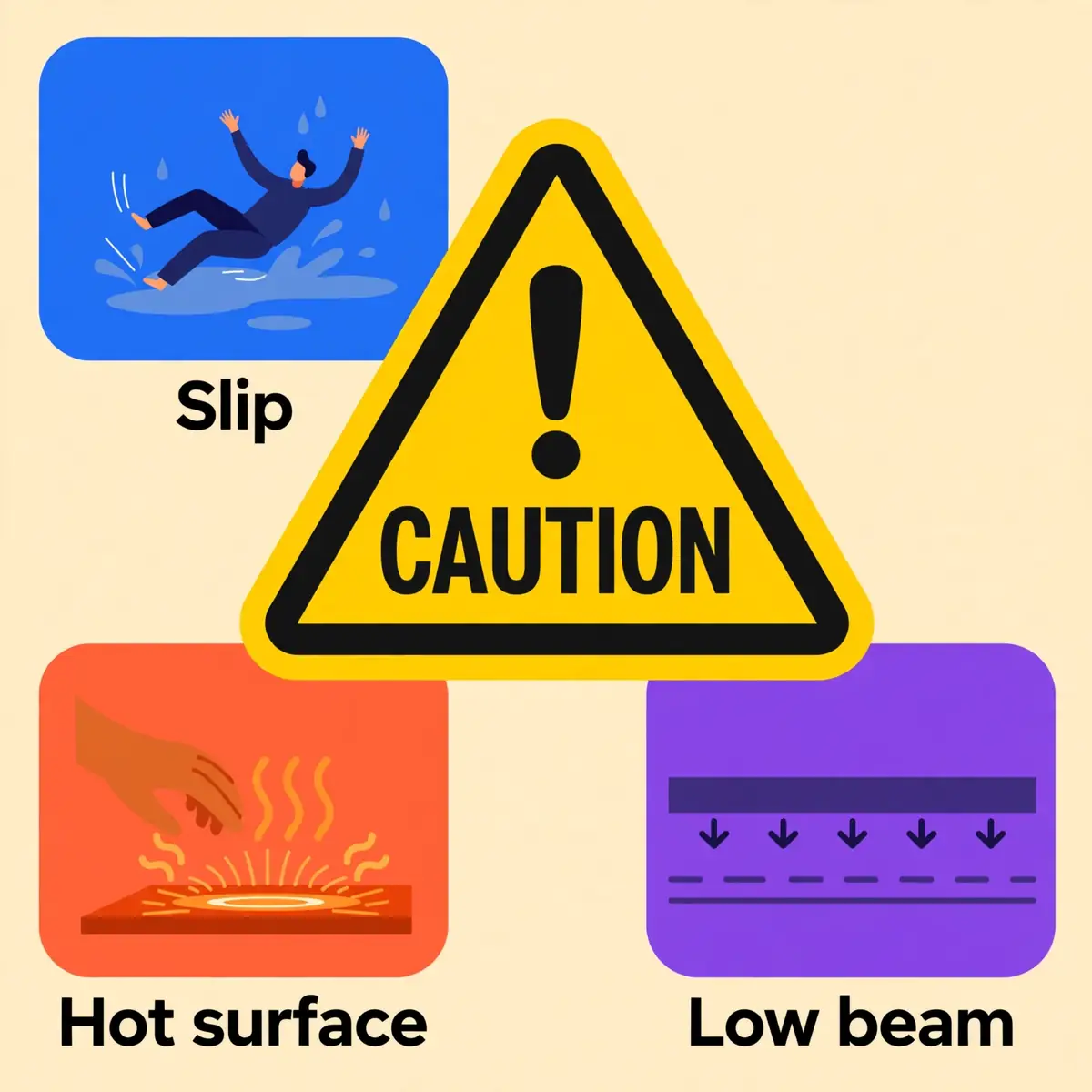
A caution sign marks a hazard that is real but not immediately life-threatening. It says that someone could be hurt if the hazard is ignored or if the unsafe practice continues. The injury it warns of is minor or moderate: a sprained ankle from a slip, a cut from a sharp edge, a burn from a hot surface. The sign gives a warning in time for the reader to change course, slow down or take a precaution.
That meaning is fixed by the standards that govern the sign, not by the person who prints it. The word CAUTION, the yellow colour and the layout all carry the same message wherever the sign is used. A worker who has never visited a site before can still read the level of risk from the colour alone. That shared code is what makes the sign work across sites, contractors and languages.
The OSHA definition
The Occupational Safety and Health Administration (OSHA) defines the caution sign in 29 CFR 1910.145, the rule for accident prevention signs and tags in general industry. Paragraph (c)(2) states that caution signs shall be used only to warn against potential hazards or to caution against unsafe practices. The word "only" matters. A caution sign has one job, and it must not be used for anything else.
The same paragraph places a duty on the employer. All employees shall be instructed that caution signs indicate a possible hazard against which proper precaution should be taken. A sign that nobody has explained is only half a control. New starters, agency staff and visitors need the same instruction, because the sign assumes that the reader knows what the word CAUTION means.
The ANSI definition: minor or moderate injury
The American National Standards Institute (ANSI) standard Z535.2 covers environmental and facility safety signs. It sorts hazard alerting signs by how likely an injury is and how bad it would be. Under Z535.2, CAUTION marks a hazardous situation that, if not avoided, could result in minor or moderate injury. That definition is the test for choosing the word.
The other two signal words sit on either side of it. WARNING marks a situation that could result in death or serious injury. DANGER marks a situation that will result in death or serious injury if it is not avoided. The difference between "could" and "will" is the difference between a warning and a danger sign. Caution covers the lower end of the scale, where the realistic outcome is a minor or moderate injury.
A possible hazard, not a certain one
The word "possible" in the OSHA definition is doing real work. A caution sign does not say that injury is certain, or even likely. It says that a hazard is present and that injury is possible if the precaution is skipped. A wet floor may not trip anyone, and a low beam may not strike anyone. The sign marks the chance, not the certainty.
That distinction shapes how the sign should be read. A caution sign calls for care, not for stopping work or clearing an area. The reader should slow down, look for the hazard named on the sign and take the precaution it asks for. Treating every caution sign as an emergency would wear people out. Treating it as decoration would leave the hazard unguarded.
WarningNever ignore a caution sign because the hazard looks minor. Minor injuries cause most lost-time slips, trips and cuts. A sign that is ignored teaches everyone nearby to ignore the next one too.
How to read a caution sign
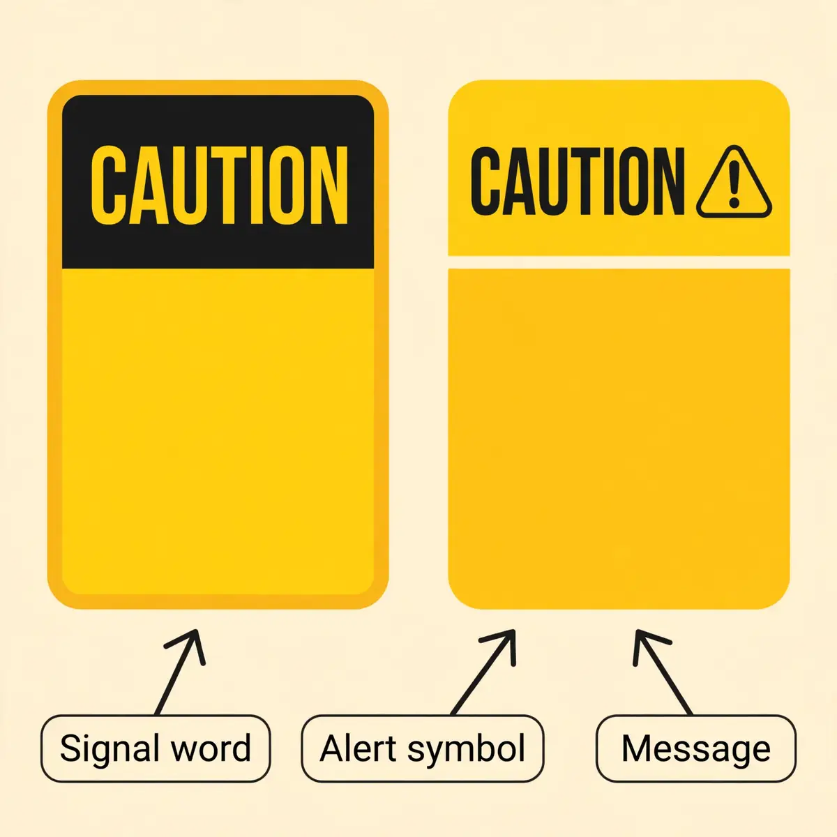
A caution sign can be read in three layers, and the layers work in order. The colour and the signal word come first and set the level of risk. The safety alert symbol and the pictogram come next and name the hazard. The message panel comes last and gives the detail: what the hazard is and what to do about it. Each layer adds meaning, and none of them works alone.
Reading the sign in that order matters most at a distance. Colour and shape are recognised long before words can be read. A yellow sign with a black panel is visible from across a warehouse floor. The reader already knows the risk level before getting close enough to read the text. The pictogram then confirms the hazard, and the words confirm the action.
The OSHA layout: black panel, yellow letters
Under OSHA 1910.145(d)(4), the standard colour of a caution sign's background is yellow. The panel is black with yellow letters. Any letters used against the yellow background are black. The colours must match the samples in ANSI Z53.1-1967 or ANSI Z535.1-2006(R2011), which OSHA incorporates by reference. That reference keeps the yellow the same from one supplier to the next.
The OSHA layout is therefore a yellow sign with a black band across the top carrying the word CAUTION in yellow letters. The message below the band sits in black letters on the yellow background. This is the format that meets the letter of the federal rule. It is the format an inspector will expect in a general industry workplace.
The ANSI layout: yellow header, black letters, safety alert symbol
The ANSI Z535.2 layout looks different but carries the same meaning. The word CAUTION appears in black block letters on a yellow background, preceded by the safety alert symbol: an exclamation mark inside an equilateral triangle. Additional text below explains the hazard in more detail. This is the format most sign suppliers sell, and it is the format most workers recognise first.
Both formats are in everyday use, and the difference between them is a source of confusion. A sign that follows the ANSI layout still satisfies the purpose of the OSHA rule, because OSHA recognises the ANSI Z535 specifications. The safe course is to buy signs that state compliance with both 1910.145 and ANSI Z535.2. The format never becomes an argument after an incident.
The message panel and the pictogram
The message panel is the part of the sign below the signal word, and it carries the specific warning. OSHA requires the wording of any sign to be easily read and concise. The sign should contain enough information to be easily understood. The wording should make a positive suggestion where possible and must be accurate in fact. A sign that says "Caution: Wet Floor" passes that test; a sign that says "Caution" and nothing else does not.
A pictogram can carry the message where words alone would be slow or unclear. Common elements on a caution sign include:
- The safety alert symbol, an exclamation mark in a triangle, which marks the sign as a hazard warning.
- A pictogram of the hazard itself, such as a slipping figure, a hand near a hot surface or a forklift.
- A short hazard statement, such as "Slip hazard" or "Hot surface".
- A short instruction, such as "Watch your step" or "Keep clear".
The pictogram matters most where readers may not share a language. A slipping figure means the same thing to a worker who reads English and to one who does not. That is why the international system pairs every warning with a pictogram. Why a sign with text alone is weaker than a sign with both text and a symbol.
Why yellow means caution
Yellow is the colour of caution across the whole United States safety system, not only on signs. OSHA 29 CFR 1910.144 states that yellow shall be the basic colour for designating caution and for marking physical hazards such as striking against, stumbling, falling, tripping and being caught in between. The same yellow marks the edges of loading docks, the corners of low beams and the stripes around open pits.
That consistency is deliberate. A worker who has learned that yellow means caution on a floor marking will read a yellow sign the same way, without being taught twice. It also explains why the colour rules are mandatory and cannot be changed for branding or preference. A yellow sign that is printed in a company colour stops being a safety sign and becomes decoration.
TipRead a sign by its shape and colour first, then by its pictogram, and only then by its words. The colour sets the risk level before the text can be read.
Caution, Warning, Danger and Notice: the four signal words
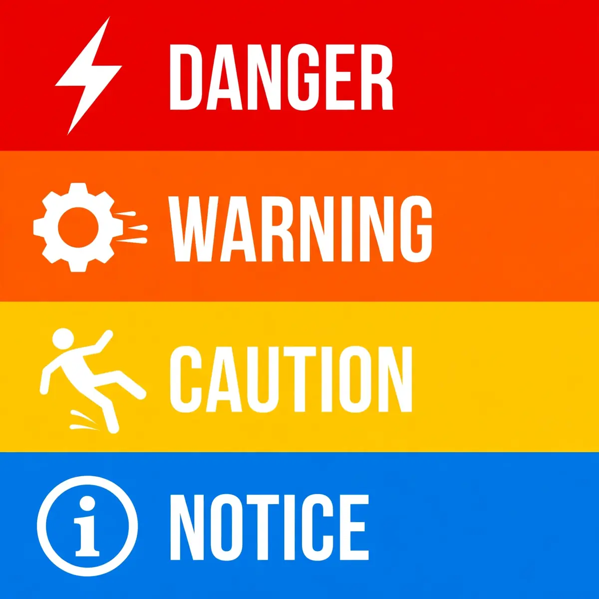
Four signal words cover almost every safety sign in a United States workplace. Each one marks a different level of risk. DANGER is the highest level, WARNING is the middle level, CAUTION is the lower level. NOTICE carries no injury warning at all. The words are not synonyms, and they are not interchangeable. Choosing the wrong word changes the message the sign sends, and it changes what the reader is expected to do.
The table below sets out the four words side by side, with the colour, the severity and the typical use of each. It is the comparison to use when deciding which sign a hazard needs. If the realistic worst outcome is a minor injury, the word is CAUTION. If it is death or serious injury, the word is WARNING or DANGER.
| Signal word | Header colour | What happens if the hazard is not avoided | Typical use |
|---|---|---|---|
| DANGER | Red | Will result in death or serious injury | Live electrical parts, confined space entry, toxic gas |
| WARNING | Orange | Could result in death or serious injury | Moving machinery, high voltage, hazardous materials store |
| CAUTION | Yellow | Could result in minor or moderate injury | Wet floor, hot surface, low clearance, forklift traffic |
| NOTICE | Blue | No injury risk; information only | Visitor check-in, PPE policy, housekeeping rules |
The one question that picks the word
Only one question decides the signal word: what is the realistic worst outcome if the hazard is not avoided? If the answer is death or serious injury, the sign must be DANGER or WARNING. If the answer is a minor or moderate injury, the sign is CAUTION. If there is no injury risk at all, the sign is NOTICE. The question is about the outcome, not about how likely the hazard is to strike.
That test keeps the system honest. A hazard that could kill must never be marked CAUTION just because the sign looks less alarming. Using a caution sign for a serious hazard understates the risk, and it leaves workers unprepared for what could happen. It is also a compliance failure, because OSHA requires the sign to match the hazard it marks.
Where WARNING fits
WARNING is the middle level, and it has a complicated legal position. OSHA 1910.145 itself classifies signs as danger, caution and safety instruction only. It does not list WARNING as a sign class. The ANSI Z535 system adds WARNING to fill the gap between the immediate danger of DANGER and the lower stakes of CAUTION. OSHA has incorporated the ANSI Z535 colour standards by reference. In practice, orange WARNING signs are accepted and expected.
The tag rule shows the same middle position. Under 1910.145(f)(7), warning tags may be used to represent a hazard level between Caution and Danger, instead of the required caution tag, provided the tag has the signal word "Warning" and meets the general tag criteria. A warning sign therefore means a hazard that could cause death or serious injury. That does not rise to the immediate danger that DANGER marks. Readers who want the full picture of the neighbouring level should read the Warning Signs guide alongside this one.
NOTICE is not a hazard sign
NOTICE signs carry no hazard warning, and that is the point. They communicate facility rules, procedures, equipment identification and visitor instructions. They use a blue background with white text. The safety alert symbol never appears on a NOTICE sign, because the symbol is reserved for injury hazard communication. A blue sign tells the reader that no one will be hurt, but that the information still matters.
Confusing NOTICE with CAUTION is a common error in both directions. A CAUTION sign used for a purely informational message, such as a visitor check-in instruction, raises the hazard signal for no reason and erodes trust in the sign system. A NOTICE sign used where an injury is possible hides the hazard entirely. When there is no injury risk, use NOTICE; when there is, use the hazard word that matches the severity.
AlertNever downgrade a sign to make a hazard look less alarming. A DANGER hazard marked CAUTION is a compliance failure, and it will count against the employer if someone is hurt.
Common caution signs and what each one tells you
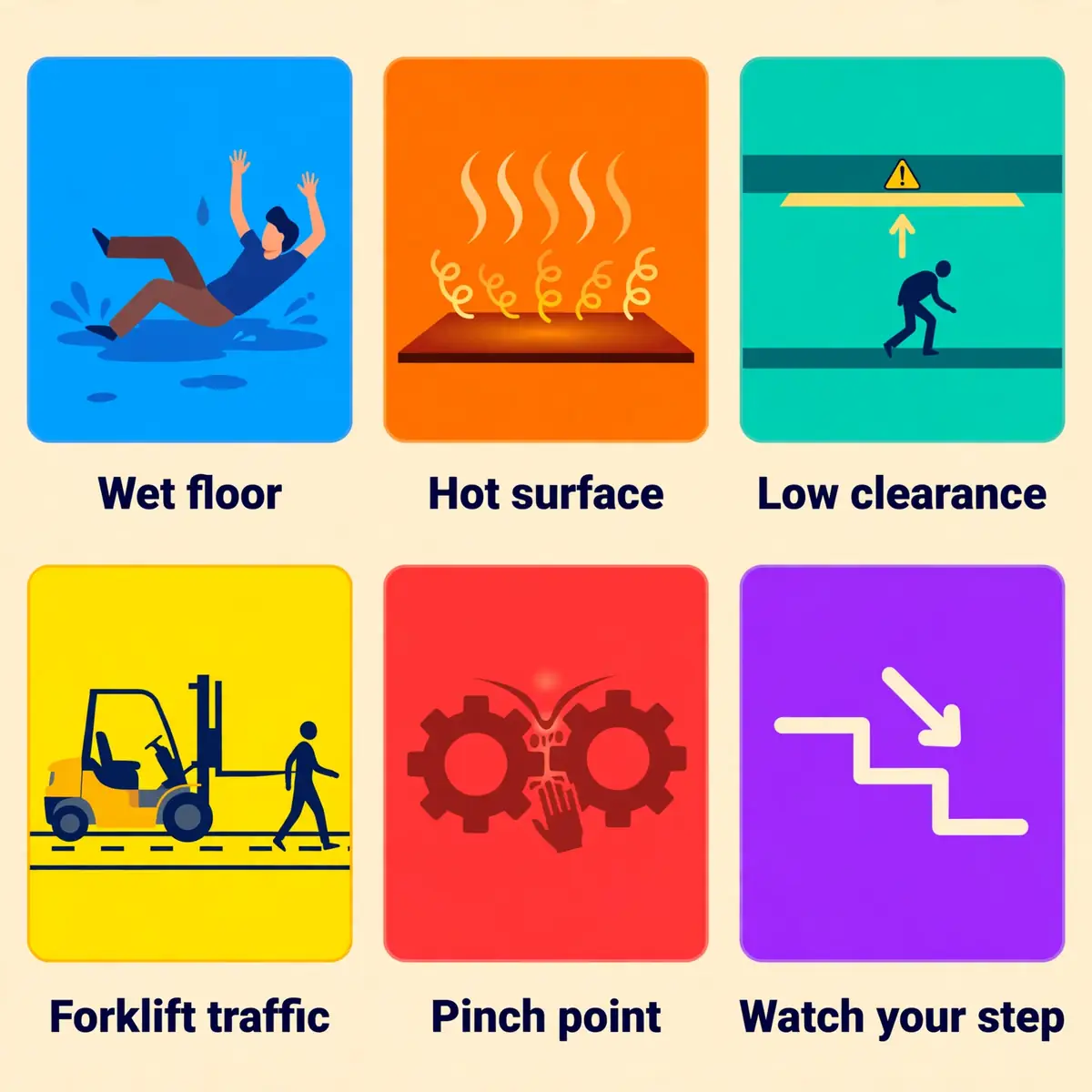
Caution signs cover the widest range of everyday workplace hazards, which is why they are the most common signs on most sites. The table below covers the signs a reader is most likely to meet, with the hazard each one marks and the action each one calls for. The wording on a real sign may differ, but the hazard and the action stay the same.
Every sign in the table follows the same pattern: a hazard that could cause a minor or moderate injury. A precaution that is simple to take. None of these hazards should be marked with a DANGER sign, and none of them should be left unmarked. The sign is the warning that lets the reader take the precaution before reaching the hazard.
| Sign text | Hazard | What to do |
|---|---|---|
| Caution: Wet Floor | Slippery floor after cleaning or a spill | Slow down, walk around the wet area, hold a rail |
| Caution: Slippery Surface | Wet, oily or icy floor | Shorten steps, wear suitable footwear, report the cause |
| Caution: Watch Your Step | Uneven floor, step or threshold | Look down, lift feet clear, use a handrail |
| Caution: Low Clearance | Beam or pipe at head height | Duck, keep a hard hat on, do not rush under it |
| Caution: Hot Surface | Heated equipment, steam pipe or oven door | Do not touch, use gloves or tools provided |
| Caution: Pinch Point | Moving parts that can trap fingers or hands | Keep hands clear, keep guards in place |
| Caution: Forklift Traffic | Vehicles sharing space with pedestrians | Keep to marked walkways, make eye contact with drivers |
| Caution: Mind the Step | Change in floor level at a doorway | Step down carefully, hold the rail where fitted |
| Caution: Trip Hazard | Cables, hoses or uneven ground across a walkway | Step over with care, report cables that cross walkways |
| Caution: Automatic Start-Up | Equipment that can start without warning | Stay clear, isolate before maintenance, follow lockout |
Slips, trips and falls
Slips, trips and falls are the most common reason for a caution sign. The most common cause of minor injury at work. A wet floor, an icy step, a cable across a walkway or an uneven threshold can all be marked with a caution sign. The sign warns the reader to slow down and to look where they are stepping, which is often enough to prevent the fall.
The sign is a warning, not a fix. A wet floor still needs drying or mopping, and a cable still needs rerouting or covering. A reader who sees a slip warning should slow down, use a handrail where one is fitted. Report the hazard if the cause has not been dealt with. The sign buys time; the fix removes the risk.
Hot surfaces and moving parts
Hot surfaces and moving parts are the second large family of caution signs. A hot surface sign belongs on heated equipment such as ovens, steam pipes and heat sealers. A pinch point sign belongs on machinery where moving parts can trap a hand or a finger. Both hazards can burn or crush, and both are avoidable if the reader keeps clear.
The precaution for these hazards is usually simple: do not touch, keep hands clear and keep guards in place. Where the work needs contact with the hazard, the sign pairs with personal protective equipment, such as heat-resistant gloves. The PPE requirements guide covers which protection fits which hazard, and the sign should point the reader toward it.
Vehicles and shared spaces
Forklift traffic signs mark the places where vehicles and pedestrians share space, such as warehouse aisles and loading bays. The hazard is a moving vehicle in a space where people walk. The precaution is to keep to marked walkways and make eye contact with drivers before crossing. A caution sign is the right level here when the traffic is moderate and the routes are marked.
Where vehicle traffic is heavy, fast or uncontrolled, a caution sign may not be enough. A warning sign or a physical barrier may be needed instead. The decision turns on the realistic worst outcome: a slow forklift in a marked aisle is a caution hazard, while a fast vehicle in an unmarked yard is a warning hazard. The sign must match the traffic, not the habit of the site.
Where caution signs belong — and where they do not
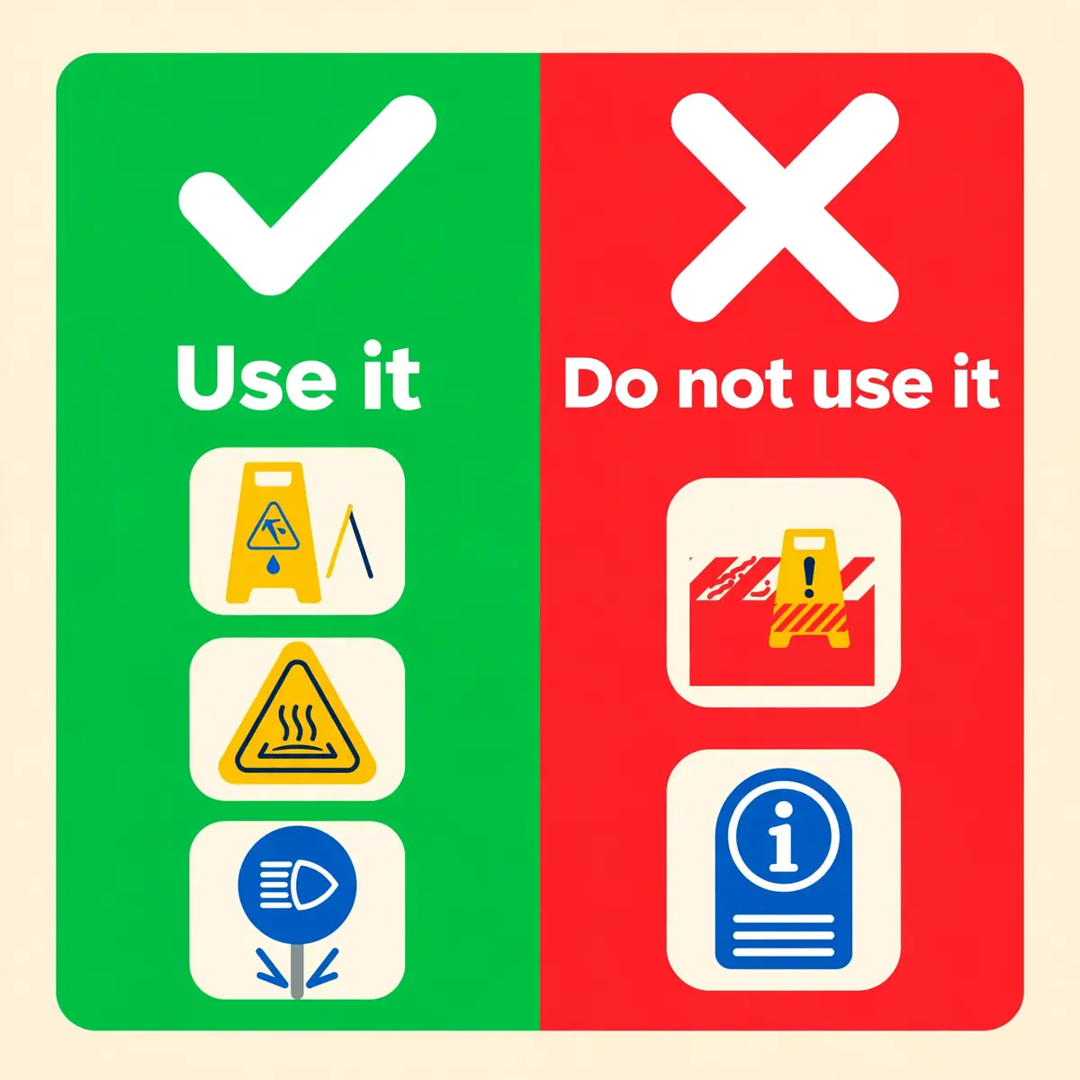
A caution sign belongs wherever a possible hazard remains after other controls have been applied. Where the realistic outcome is a minor or moderate injury. That covers a large part of daily working life: wet floors, low beams, hot pipes, pinch points, shared vehicle routes and uneven ground. The sign stands at the point where a person must make a decision, before they reach the hazard.
The sign does not belong everywhere else. It does not belong on a life-threatening hazard, it does not belong on a purely informational message. It does not belong where the hazard has already been removed. A sign that is used in the wrong place weakens every other sign on the site, because readers learn to ignore signs that cry wolf.
Hazards that suit a caution sign
The hazards that suit a caution sign share two features: the injury is minor or moderate, and a simple precaution prevents it. The list below covers the most common cases. It is the list to check first when deciding whether a caution sign is the right choice for a hazard.
- Slippery floors after cleaning, spills or rain tracked indoors.
- Uneven surfaces, steps, thresholds and changes in floor level.
- Low overhead clearance from beams, pipes or ducting.
- Hot surfaces on ovens, steam pipes and heated equipment.
- Pinch points and moving parts that can trap hands or fingers.
- Shared routes where forklifts and pedestrians cross.
- Stored energy in equipment that holds charge after switch-off.
Each of these hazards is a physical hazard of the kind OSHA 1910.144 describes: striking against, stumbling, falling, tripping and being caught in between. Yellow is the colour for all of them, on the sign and on the floor marking alike. The sign and the marking work together, and the reader should treat them as one warning.
Unsafe practices the sign corrects
A caution sign is not only for physical hazards. OSHA 1910.145(c)(2) also allows it to caution against unsafe practices, which means it can correct behaviour as well as mark a place. A sign that says "Caution: Do Not Climb on Dock" corrects a practice, not a fixed hazard. The same applies to signs that warn against jumping from a loading dock or against standing under a suspended load.
Behaviour signs work best when the practice is specific and the reason is clear. A sign that says "Caution: Dust Mask Must Be Worn" tells the reader what to do and implies why. A vague sign that says "Caution: Be Careful" tells the reader nothing and will be ignored. The message must name the practice and the precaution, or the sign has no content to follow.
When a caution sign is the wrong sign
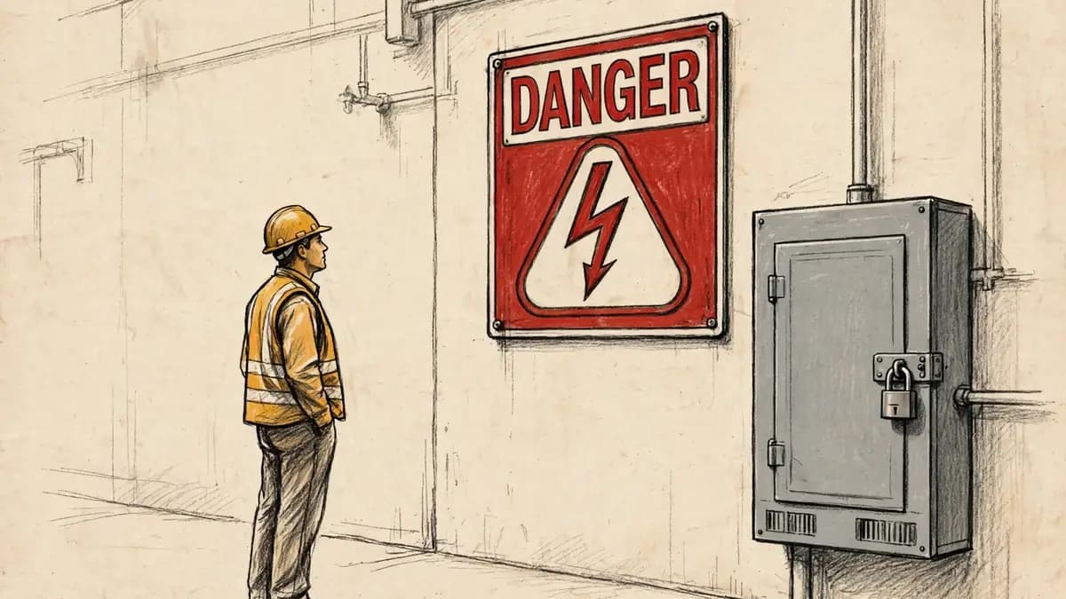
A caution sign is the wrong sign whenever the realistic worst outcome is death or serious injury. Live electrical parts, a confined space with a toxic atmosphere, an unguarded floor opening, where fall protection is required, and an explosive gas area all need DANGER signs, not CAUTION signs. Marking them with a yellow sign tells the reader that the risk is moderate. The reader will act on that message.
The same rule applies in the other direction. A caution sign is also the wrong sign where there is no injury risk at all, because the sign then claims a hazard that does not exist. A visitor check-in instruction, a housekeeping reminder or a PPE policy notice belongs on a blue NOTICE sign. Using CAUTION for information trains readers to treat the word as background noise.
WarningA caution sign never replaces guarding, isolation, ventilation or training. It warns about the risk that remains after those controls. It must never be used as a substitute for them.
A sign is the last control, not the first
Signs sit at the bottom of the hierarchy of controls, below elimination, substitution, engineering controls and administrative controls. A wet floor should be dried, a low beam should be padded or rerouted. A pinch point should be guarded before a sign is considered. The sign is the control for the risk that remains after the higher controls have done their work.
That order matters for anyone choosing a sign. If the hazard can be removed, remove it and skip the sign. If it can be guarded, guard it and use the sign only for the risk that remains. A sign posted beside a hazard that could have been fixed is evidence that the higher controls were skipped. It will read that way to an inspector.
The UK and ISO view: there is no "caution" class
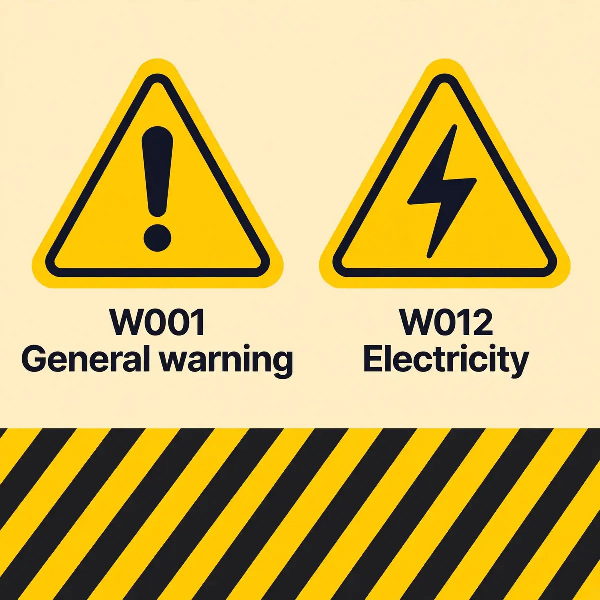
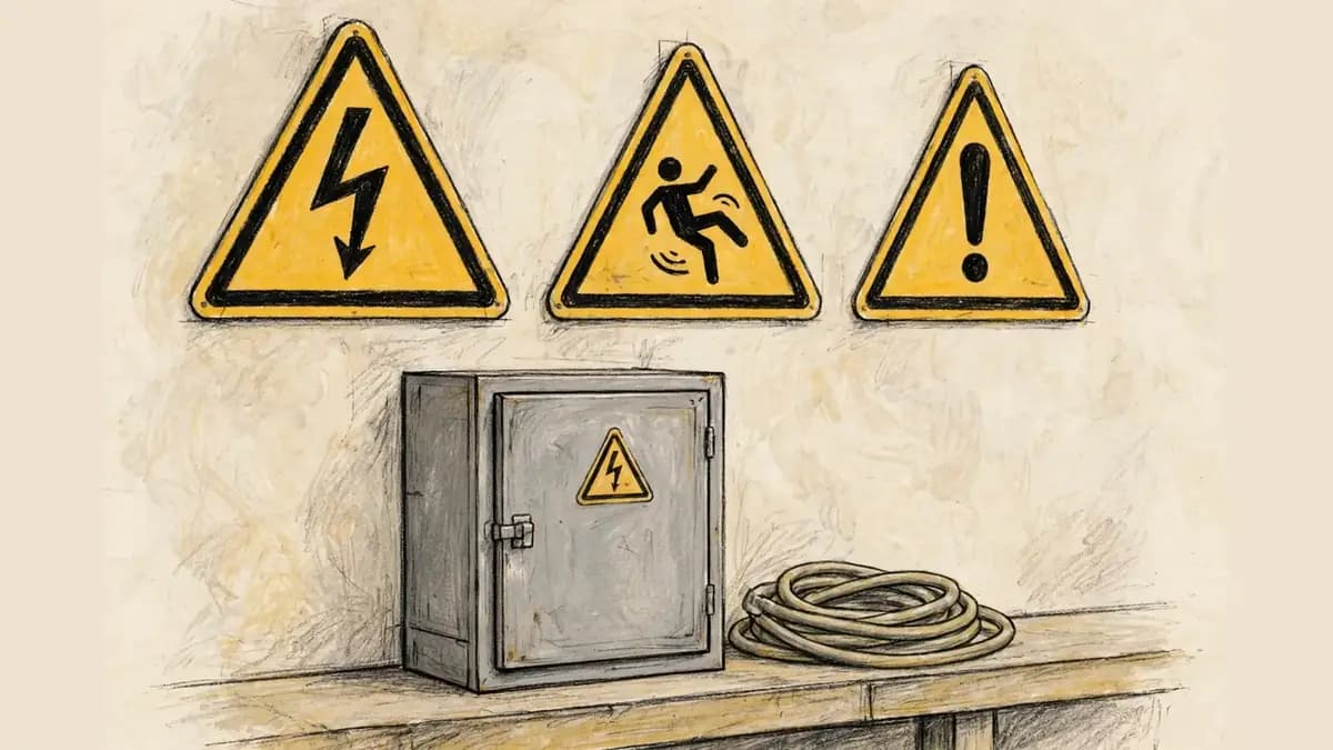
Readers in Great Britain will look in vain for a "caution" class of sign in the law. The Health and Safety (Safety Signs and Signals) Regulations 1996, which govern safety signs at work, use five families of hazard sign: prohibition, warning, mandatory, emergency escape and first aid, and firefighting. There is no caution family. The hazards that an American site marks CAUTION are marked in Britain by yellow triangle warning signs.
That difference is a matter of taxonomy, not of safety. Both systems use yellow for the same message: be careful, take precautions, examine. The difference is in how the levels are divided. The United States divides hazard signs by severity with signal words, while the United Kingdom and the ISO system divide them by shape and colour, with the triangle covering every level of warning.
The yellow triangle warning sign
Under Schedule 1 of the 1996 Regulations, a warning sign is triangular, with a black pictogram on a yellow background with black edging. The yellow part must take up at least 50% of the area of the sign. The colour table in the same Schedule gives yellow or amber one meaning only: warning sign, "be careful, take precautions, examine". A yellow triangle means the same thing in a factory in Leeds, a warehouse in Glasgow and a laboratory in Cardiff.
The Regulations list the warning signs that workplaces use most often, including electricity, slippery surface, overhead load, hot surface, corrosive material and biological risk. Each one names a hazard and implies the precaution that goes with it. The pictograms come from BS EN ISO 7010, the international standard for registered safety signs. The same triangle carries the same meaning across Europe.
The general warning sign W001
Where no specific pictogram exists for a hazard, the general warning sign is used instead. It is a black exclamation mark in a yellow triangle, known in ISO 7010 as W001, with words underneath explaining the hazard. It is the international equivalent of a general caution sign: a sign for a hazard that needs a warning but has no picture of its own.
The W001 sign shows how the two systems meet. An American site might post a rectangular "Caution: Watch Your Step" sign, while a British site posts a W001 triangle with the same words beneath it. The hazard, the colour and the precaution are the same. Only the shape and the signal word differ, and a reader who knows both systems can read either one.
What "caution" means on a UK site
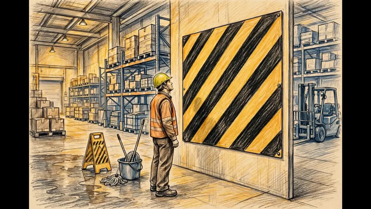
The word "caution" still appears on British sites, even though it is not a legal class of sign. It appears in the yellow and black striped markings that warn of physical hazards, such as the edges of steps, drops and obstacles. Schedule 1 of the 1996 Regulations requires those stripes to sit at an angle of about 45 degrees, in bands of more or less equal size. The stripes mark the hazard itself, while the triangle warns of it.
The word also appears on general warning signs and on temporary signs used during maintenance or cleaning. A "Caution: Wet Floor" stand in a British shop is not a signboard under the Regulations, but it carries the same yellow and black message and the same expectation: slow down and take care. Readers should treat it with the same respect as a formal warning sign.
Reading a sign abroad
Anyone who works on sites in more than one country needs to know both systems, because the same colour can mean a different level of risk. In the United States, yellow means CAUTION and the lowest hazard level. In the United Kingdom, yellow means warning, and the triangle can mark a hazard of any severity, including one that could kill. A yellow triangle on a British site must never be read as a low-level warning.
The safe habit is to read the pictogram and the words, not the colour alone. The pictogram names the hazard, and the words name the precaution, in both systems. Colour sets the first impression, and the detail corrects it. Workers who travel between sites should be briefed on the local system before they start work, because the sign code is part of the site induction.
How to place a caution sign so it works
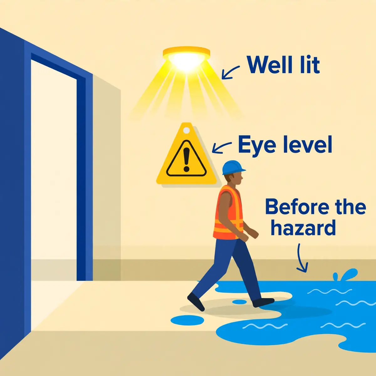
A well-chosen sign in the wrong place protects nobody. Placement follows a simple rule: the sign must be seen, read and understood before the reader reaches the hazard. A sign hidden behind a door, posted past the danger or faded beyond reading has already failed, however correct its wording may be. Placement is part of compliance, not an afterthought.
The rules below come from the standards and from the way signs are actually read on a site. Each one is a check that can be done on a walk around the premises, with no equipment and no expertise. A sign that fails any of them should be moved, replaced or removed.
Before the hazard, not beside it
The sign must stand at the point where a person must make a decision, before they reach the hazard. A wet floor sign belongs at the entrance to the wet area, not in the middle of it. A low clearance sign belongs before the beam, at a distance that lets the reader duck in time. A forklift traffic sign belongs at the entrance to the shared aisle, not at the far end of it.
OSHA's tag rule states the same principle for tags: they shall be affixed as close as safely possible to their respective hazards by a positive means, such as string, wire or adhesive, that prevents their loss or unintentional removal. The same logic applies to signs. Close to the hazard means close enough to warn, and far enough ahead to act.
Height, size and light
A sign must be readable from the distance at which the reader needs to act. That distance sets the size of the sign, and the size sets the height of the letters. A sign that can only be read from a metre away is useless at the entrance to a warehouse aisle. A sign mounted above head height will be missed by everyone who is looking where they are walking.
The practical checks for a sign in place are short, and each one can be done in seconds:
- Stand where a reader first approaches and check that the sign is visible.
- Check that the sign sits at eye level for a person walking toward it.
- Check that the sign is lit, or made of reflective material, where the area is dark.
- Check that nothing blocks the view, such as stacked goods or an open door.
- Check that the wording can be read from the distance the reader needs.
For tags, OSHA sets a number: the signal word shall be readable at a minimum distance of five feet, or a greater distance where the hazard warrants it. Signs have no single number in the rule, because the distance depends on the site. The test is the same in both cases: can the reader see it in time to act?
Keep it visible and in good repair
Signs fade, crack, peel and get covered. A yellow sign that has faded to cream no longer reads as a caution sign. A sign covered by a notice or a poster no longer warns anyone. Signs need the same inspection routine as the equipment they guard: a regular walk around, a check of each sign. A replacement when the colour, the wording or the fixing has failed.
The ANSI Z535.2 standard makes the same point for placement in general: signs should be protected from foreseeable visual obstruction and damage, such as fading from ultraviolet light, abrasion and degradation from lubricants, chemicals and dirt. A sign that is left to decay sends its own message. The message is that nobody on the site is watching.
TipCheck signs on the same walk as the hazard inspection. A sign that is faded, hidden or out of date is a finding, not a decoration.
Caution tags and temporary hazards
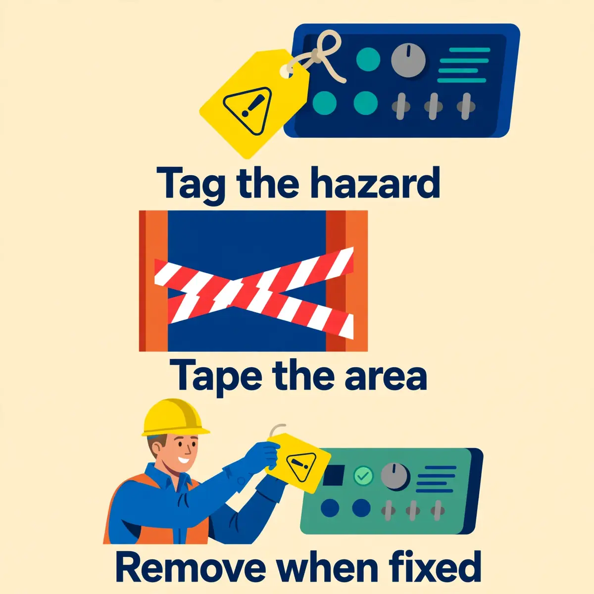
Not every hazard deserves a permanent sign. Some hazards are temporary: a machine under repair, a floor being cleaned, a valve closed for maintenance, a piece of equipment awaiting a part. For those hazards, OSHA provides a different tool: the accident prevention tag. A caution tag marks a minor, temporary hazard until the hazard is removed or the work is finished.
Tags and signs are different objects with different rules, and confusing them is a common audit finding. A sign is permanent and belongs to the place. A tag is temporary and travels with the abnormal condition. A tag that is still hanging six months later is evidence that the abnormal condition became normal. That the hazard was never fixed.
What a caution tag is
Under 1910.145(f)(2), a tag is a device usually made of card, paper, pasteboard, plastic or other material, used to identify a hazardous condition. Every tag must contain a signal word and a major message. The signal word is the word that captures attention, such as "Caution", and the major message is the part that names the specific hazard or the instruction, such as "Do Not Use" or "Close Clearance".
A caution tag is the tag for a minor hazard. Paragraph (f)(6) states that caution tags shall be used in minor hazard situations where a non-immediate or potential hazard or unsafe practice presents a lesser threat of employee injury. That caution tags shall be used only in these situations. The word "only" appears again, and it means the same thing as it does for signs: the tag must match the hazard.
When to use a tag instead of a sign
Tags are used for conditions that are out of the ordinary, unexpected or not readily apparent. A machine that is normally safe becomes a hazard when it is opened for repair. A floor that is normally dry becomes a hazard when it is being cleaned. A valve that is normally open becomes a hazard when it is closed for maintenance. In each case the tag warns of a condition that the reader would not expect.
Tags need not be used where signs, guarding or other positive means of protection are already in place. The tag is the warning for the gap between the normal state and the safe state. It is removed when the gap closes. That is the rule in paragraph (f)(3): tags shall be used until the identified hazard is eliminated or the hazardous operation is completed.
The five-foot rule and the removal rule
Two numbers govern tags, and both are easy to check. The first is readability: under paragraph (f)(4)(ii), the signal word shall be readable at a minimum distance of five feet, or a greater distance where the hazard warrants it. A tag whose signal word cannot be read from five feet away fails the rule, however clear the rest of the message may be.
The second is removal. A tag must come down when the hazard is gone or the work is done. It must never be left as a permanent warning. A tag that outlives its hazard teaches readers that tags are permanent, and the next tag will be ignored. The removal of the tag is part of the job, not an afterthought. It should be written into the work instruction.
Barricade tape and temporary marking
Temporary hazards also need temporary barriers, and the ANSI Z535.5 standard covers safety tags and barricade tapes for that purpose. Yellow and black barricade tape marks a caution area, just as a caution tag marks a caution hazard. The tape keeps people out of the area while the work is done. It comes down with the tag when the work is finished.
The same logic applies to floor markings. Yellow and black stripes at 45 degrees mark the edges of drops, steps and obstacles. They are part of the same colour code as the caution sign. The sign, the tag, the tape and the marking all say the same thing in different forms: a minor hazard is here, take care. Keep out until it is fixed.
AlertA caution tag that is still hanging after the hazard is gone is a finding, not a warning. Remove the tag when the work is finished, or the next tag will be ignored.
Choosing the right sign: a step-by-step check
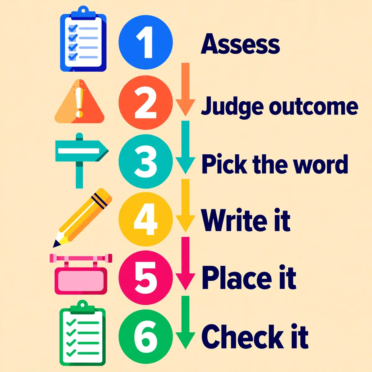
Choosing a caution sign is a short procedure, and it starts before the sign is ordered. The procedure below turns those rules into a sequence that can be followed for any hazard, on any site. Each step answers one question, and the answer to each step decides the next one. Skipping a step is how the wrong sign ends up on the wall.
The procedure works for a single sign and for a whole site. For a whole site, repeat it for each hazard. Record the decisions in the signage register so the next inspection can check them. A register also stops the slow drift that fills sites with signs nobody remembers ordering.
Step 1: Name the hazard in a risk assessment
Start with the hazard, not with the sign. A risk assessment should already name the hazard, who is exposed to it and how they could be hurt. If no assessment exists, write one before choosing a sign. A sign chosen without an assessment is a guess. A guess will be wrong as often as it is right.
The assessment also decides whether a sign is needed at all. In Great Britain, the law requires a sign only where a risk assessment shows a significant risk that other controls cannot remove or reduce enough. The same logic applies in the United States: if the hazard can be removed or guarded, remove it or guard it first. Use the sign only for the risk that remains.
Step 2: Judge the realistic worst outcome
Ask what happens if the hazard is not avoided, at its realistic worst. If the answer is death or serious injury, stop: the sign is DANGER or WARNING, not CAUTION. If the answer is a minor or moderate injury, such as a sprain, a cut or a first-degree burn, the sign is CAUTION. If there is no injury risk at all, the sign is NOTICE.
Judge the outcome honestly, and write the reasoning down. The judgement is the part an inspector will ask about after an incident. A written reason is the evidence that the choice was considered. An undocumented choice looks like no choice at all.
Step 3: Pick the signal word and the format
Pick the signal word from the outcome in step 2, and pick the format from the site. The OSHA format has a black panel with CAUTION in yellow letters on a yellow background. The ANSI format has CAUTION in black letters on yellow with the safety alert symbol. Either format is recognised, and the safest choice is a sign that states compliance with both 1910.145 and ANSI Z535.2.
Check the format against the hazard, not against the catalogue. A sign that is cheap, small or printed in a company colour may be easy to order. It will not survive an inspection. The format is part of the safety system, and it must match the standard exactly.
Step 4: Write the message and choose the pictogram
Write the message in short, plain words that name the hazard and the precaution. "Caution: Wet Floor" names both. "Caution: Hot Surface — Do Not Touch" names both. The wording should be easily read and concise. It should make a positive suggestion where possible, as OSHA 1910.145(e)(2) requires. A message that only says "Caution" names neither.
Choose a pictogram that matches the hazard: a slipping figure for a slippery floor, a hand above wavy lines for a hot surface, a forklift for vehicle traffic. Where no pictogram exists for the hazard, use the general warning symbol, the exclamation mark in a triangle, with words underneath. The pictogram must match the message, or the sign will contradict itself.
Step 5: Place the sign and brief the readers
Place the sign where it will be seen before the hazard is reached, at eye level, in good light and clear of obstruction. Then brief the people who will see it. OSHA requires all employees to be instructed that caution signs indicate a possible hazard against which proper precaution should be taken. The same instruction applies to tags.
The briefing need not be long. It should cover what the sign means, what the hazard is and what precaution to take. It should be repeated for new starters and for agency staff, because the sign assumes knowledge that a new reader may not have. A sign that has never been explained is a sign that has never been read.
Step 6: Record it and check it again
Record the sign in the signage register, with the hazard, the signal word, the location and the date it was placed. Then check it on the regular inspection walk: is the colour still yellow, is the wording still readable, is the sign still in the right place, and does the hazard still exist? A sign that fails any of those checks should be replaced or removed.
The register also stops duplication. Two signs for the same hazard, or a sign and a tag for the same hazard, confuse the reader and dilute the warning. One hazard, one sign, one message is the rule, and the register is how it is enforced.
Common mistakes with caution signs
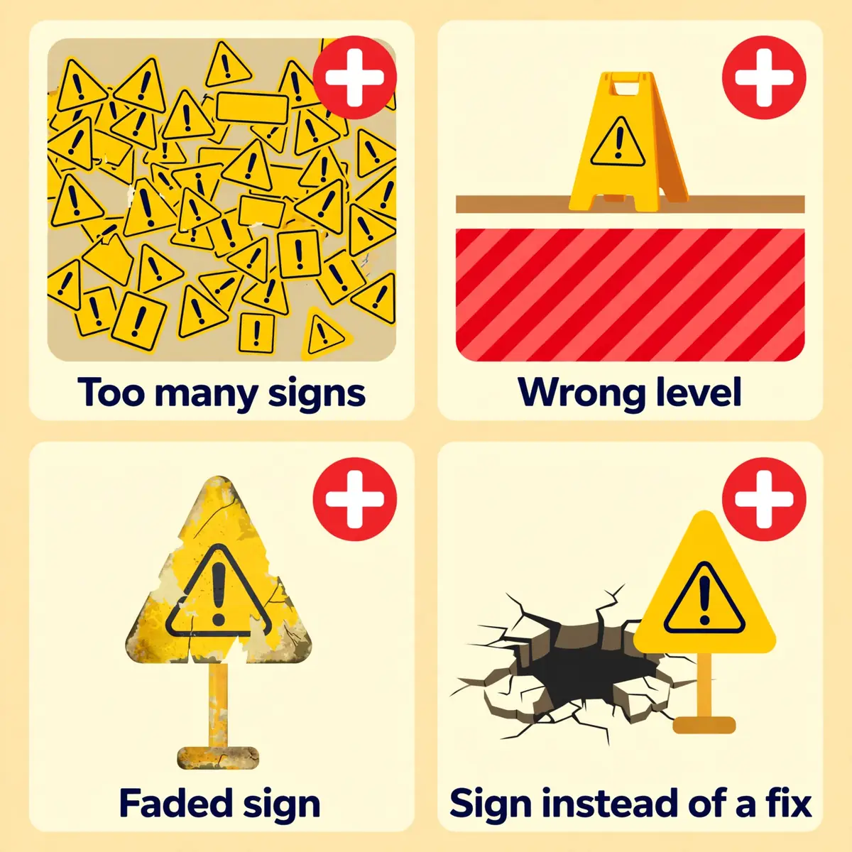
Most caution sign failures are not failures of design. They are failures of judgement: the wrong word, too many signs, a sign used for information, a sign left to fade, or a sign used instead of a fix. Each mistake has the same effect. It teaches readers that signs do not mean what they say. The next sign is ignored a little more easily.
The mistakes below are the ones that appear most often on site inspections. Each one is easy to spot on a walk around, and each one is easy to fix. A site that avoids all five has a sign system that readers can trust. A trusted sign system is one that gets read.
Using caution for a serious hazard
The most dangerous mistake is downgrading a serious hazard to a caution sign. A live electrical panel, an unguarded opening or a toxic atmosphere marked CAUTION tells the reader that the risk is moderate. The reader will act on that message. The precaution for a moderate risk is to slow down; the precaution for a lethal risk is to stay away. The wrong sign invites the wrong action.
Downgrading is also a compliance and liability failure. If a hazard meets the criteria for a DANGER sign under OSHA 1910.145, using a CAUTION sign in its place is not compliant. An injury will show that the employer knew the severity and chose to understate it. When the outcome could be death or serious injury, the sign must say so.
Posting caution signs everywhere
The second mistake is the opposite: posting caution signs for every minor risk until the site is covered in yellow. A wall of caution signs teaches readers that the word means nothing, because it appears where nothing can hurt them. The signs that matter disappear into the background, and the reader stops looking at any of them.
The cure is to sign only the hazards that the risk assessment identifies as significant. A hazard that is trivial, or that is already controlled by guarding, needs no sign. Fewer signs, each one marking a real hazard, will be read more carefully than a hundred signs marking nothing in particular. Quality beats quantity in signage.
Using caution for information only
The third mistake is using a caution sign where no injury is possible. A sign that says "Caution: Employees Only" or "Caution: Keep Area Clean" claims a hazard that does not exist, and it spends the authority of the word CAUTION on a message that carries no risk. Readers learn that the word can mean anything, and they stop treating it as a warning.
The correct sign for information is NOTICE, in blue, with no safety alert symbol. A PPE policy reminder, a visitor instruction or a housekeeping rule belongs on a notice sign. Reserving CAUTION for real hazards keeps the word sharp, and a sharp word is one that gets obeyed.
Letting signs fade, hide or outlive the hazard
The fourth mistake is neglect. Signs fade in sunlight, peel in damp, crack in cold and get hidden behind stacked goods, open doors and new equipment. A sign that cannot be read is not a sign. A sign that marks a hazard that no longer exists is worse than no sign, because it teaches readers that signs lie about the site.
The fix is a routine: check every sign on the inspection walk, replace any sign that is faded, damaged or hidden. Remove any sign whose hazard has gone. A sign should be removed as soon as the hazard is removed, just as a tag is removed when the work is finished. The site should never carry a warning for a hazard that no longer exists.
Posting a sign instead of fixing the hazard
The fifth mistake is the most common of all: posting a sign instead of fixing the hazard. A wet floor that is signed but never dried, a low beam that is signed but never padded, a pinch point that is signed but never guarded. Each one is a hazard that was warned about and never controlled. The sign becomes the excuse for leaving the hazard in place.
A sign is the last control, not the first. It must never be used as a substitute for the higher controls. If the hazard can be removed, remove it. If it can be guarded, guard it. The sign belongs on the risk that remains after those controls. An inspector who finds a sign beside a fixable hazard will ask why the fix was never made.
WarningA sign that warns of a hazard nobody fixed is not a control. Fix the hazard first, then sign the risk that remains.
What to do when you see a caution sign
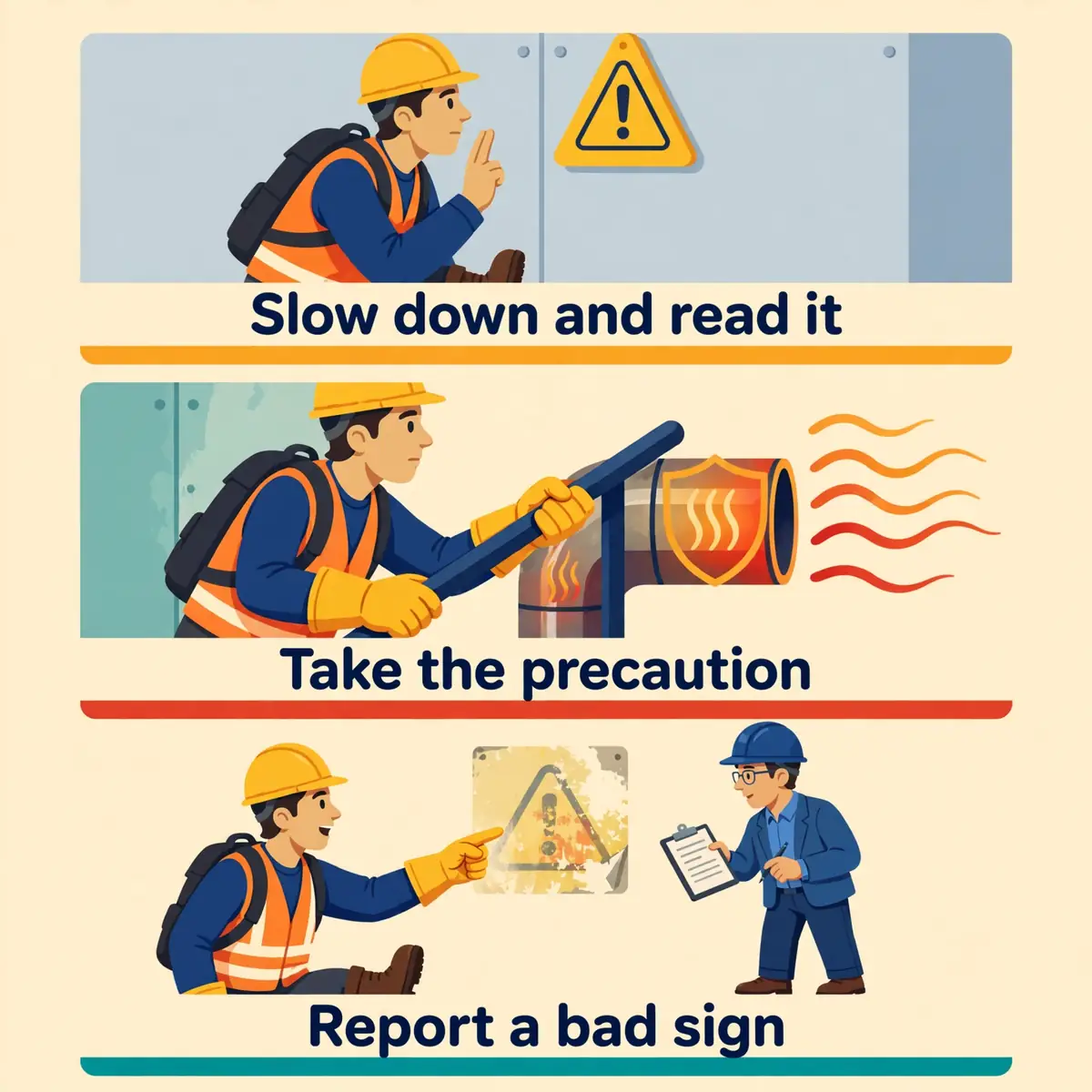
Everything so far has been written for the person who chooses the sign. This section is for the person who meets one. A caution sign is a short message with a clear demand: slow down, read it, take the precaution it names, and keep going. The whole exchange takes seconds, and it is the difference between a warning that works and one that does not.
The steps below apply to any caution sign, in any workplace, in any country. They need no training beyond the instruction that OSHA requires every employee to receive: a caution sign indicates a possible hazard against which proper precaution should be taken. That instruction is the whole of the reader's job.
Slow down and read the whole sign
The first step is the simplest and the most often skipped: slow down and read the sign. Colour and shape give the risk level, but only the words give the hazard and the precaution. A yellow sign that says "Wet Floor" needs a different response from a yellow sign that says "Hot Surface", and the reader who only sees the colour will not know which one they face.
Slowing down also gives the reader time to look for the hazard itself. A wet floor sign should be followed by a look at the floor. A low clearance sign should be followed by a look up. The sign points at the hazard, and the reader should confirm it with their own eyes before moving on. A sign that cannot be matched to a visible hazard should be reported.
Take the precaution it names
The second step is to do what the sign asks. Most caution signs ask for one of a small set of precautions. Each one is easy to take in the moment. The list below covers the precautions that appear most often on caution signs. The action that goes with each one.
- Slow down and shorten steps where the floor is slippery or uneven.
- Hold a rail or a fixed support where one is fitted.
- Keep hands clear of hot surfaces, pinch points and moving parts.
- Wear the protective equipment the sign names, such as gloves or a dust mask.
- Keep to marked walkways where vehicles and pedestrians share space.
- Duck or wait where the sign warns of low clearance or overhead work.
Where the sign names protective equipment, the reader should wear it before entering the area, not after. The PPE requirements guide explains which protection fits which hazard. A sign that calls for equipment is also a reminder to check that the equipment is available and in good repair.
Report a sign that is wrong, damaged or out of date
The third step is to report a sign that is wrong. A sign that is faded beyond reading, hidden behind goods, placed past the hazard or marking a hazard that no longer exists should be reported to a supervisor, not ignored. The reader is often the first person to notice the failure, because the reader is the person the sign is meant to protect.
Reporting a wrong sign is not complaining. It is part of the safety system, and it is the only way the sign system stays honest. A sign that is wrong and unreported will mislead the next reader. The next reader may be the one who is hurt. The same duty applies to a missing sign: a hazard with no warning at all should be reported the same way.
When the sign conflicts with what you were told
Sometimes the sign and the instruction disagree. A supervisor may say that a floor is dry while the sign says it is wet, or that a machine is safe while the sign says it is hot. In that case the sign wins until the conflict is resolved. The sign is the standing warning for the hazard, and a verbal instruction does not cancel it.
The right action is to stop, follow the sign and ask the supervisor to resolve the conflict. Do not remove the sign, cover it or walk past it on the strength of a spoken word. If the hazard has genuinely gone, the sign should be removed through the proper route, and the removal should be recorded. Until then, the sign stands.
After a minor injury, get first aid and report it
Caution signs warn of minor or moderate injury, and minor injuries still need care. A slip that twists an ankle, a touch that burns a hand or a knock that cuts a forehead should be treated at once, even if it seems small. The first aid kitguide covers what a kit should hold and how to use it. The injury should be reported so the hazard can be checked.
Reporting a minor injury matters for two reasons. It gets the injured person the care they need. It tells the employer that the sign, the precaution or the control failed. A minor injury that is not reported is a warning that nobody heard. The next person to meet the same hazard may not be so lucky. Practice emergency procedures so the response is ready before it is needed, and keep the OSHA training that explains these signs up to date.
Frequently Asked Questions
What does a caution sign mean?
A caution sign warns of a possible hazard that could cause minor or moderate injury if it is ignored, such as a slip on a wet floor, a cut from a sharp edge or a burn from a hot surface. It tells the reader to slow down, read the message and take the precaution named on the sign.
What is the difference between a caution sign and a warning sign?
A caution sign (yellow) marks a hazard that could cause minor or moderate injury, while a warning sign (orange) marks a hazard that could cause death or serious injury. The test is the realistic worst outcome: if it could kill or seriously injure, the sign is WARNING or DANGER, not CAUTION.
What colour is a caution sign?
A caution sign is yellow and black. Under OSHA 1910.145 the background is yellow with a black panel carrying CAUTION in yellow letters. Under ANSI Z535.2 the word CAUTION appears in black letters on yellow, with the safety alert symbol beside it. Yellow is also the OSHA colour for marking physical hazards under 1910.144.
When should a caution sign be used instead of a danger sign?
A caution sign should be used when the realistic worst outcome is a minor or moderate injury, such as a slip, a cut or a burn. A danger sign must be used when the hazard will cause death or serious injury if it is not avoided, such as live electrical parts or a toxic atmosphere. A caution sign must never replace a danger sign.
Are caution signs required by law?
In the United States, OSHA 29 CFR 1910.145 requires caution signs to be used to warn against potential hazards or unsafe practices in general industry. Requires all employees to be instructed in what they mean. In Great Britain there is no caution class. The same hazards are marked by yellow triangle warning signs under the Health and Safety (Safety Signs and Signals) Regulations 1996.
What is the difference between a caution sign and a caution tag?
A caution sign is permanent and belongs to a place, while a caution tag is temporary and travels with an abnormal condition, such as a machine under repair. Under OSHA 1910.145(f)(6), caution tags are used only in minor hazard situations. They must be removed when the hazard is eliminated or the work is completed.
Do caution signs exist in the UK?
Not as a legal class of sign. The UK system has no caution category. Hazards that an American site marks CAUTION are marked by yellow triangle warning signs under the 1996 Regulations. The word "caution" still appears on UK sites on temporary signs and on yellow and black striped markings for physical hazards.
Sources
- OSHA — 29 CFR 1910.145, Specifications for accident prevention signs and tags
- OSHA — 29 CFR 1910.144, Safety color code for marking physical hazards
- ANSI — ANSI Z535.2-2023: Environmental and Facility Safety Signs
- Safeopedia — What is the difference between a warning sign and a caution sign?
- MySafetySign — What Are the 4 Types of Safety Signs?
- HSE — Safety signs and signals: Guidance on Regulations L64 (3rd edition, 2015)
- legislation.gov.uk — The Health and Safety (Safety Signs and Signals) Regulations 1996, Schedule 1
- ISO 7010 — Graphical symbols: Safety colours and safety signs (catalogue entry)